-account-photo_listing.jpg)
-account-photo_listing.jpg)


Our Jury has worked with Prada, Nike, Chanel, Google, and Apple.
Best Honey Packaging Designs of 2026
View the Top Honey Packaging Designs Below
Best Honey Packaging Designs
4,200+ Submitted Designs- Advertising
- Arts & Recreation
- Automotive
- Bread
- Chocolate
- Condiment
- Condom
- Dairy Product
- E-Commerce & Retail
- Eco and Sustainable
- Entertainment
- Fashion & Beauty
- Food & Beverage
- Frozen Food
- Health & Wellness
- Honey
- Hospitality
- Jewelry
- Luxury
- Manufacturing
- Medical & Pharmacy
- Medicine
- Olive Oil
- Pet Food
- Skincare
- Soap
- Spirit
- Sports & Leisure
- Technology
- Toys and Games
- Travel
- Watch Branding
- Wine
View Design
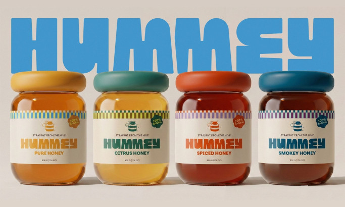
Hummey Honey Packaging Design

View Design
Daily Dairy

View Design
Beelieve

View Design
Gorski

View Design
Medove Fuzy

View Design
OPG Marinović Pčelarstvo Honey Jars
-preview.jpg)
View Design
Mielamiel
byMarimo

View Design
Smari Cretan Honey

View Design
All Natural Artisan Honey
Get Connected
With The Right Agency Partner
& Receive Proposals For FREE
-preview.jpg)
View Design
Camille Basoko Eztia
Ready to elevate your designs?