Christian Louboutin's site perfectly combines a minimalist design with bright colors.
The logo at the top of the page animates slightly as the user scrolls. As it transforms into a small symbol in the sticky navigation, it acts as a centerpiece that reinforces brand identity (the same symbol reoccurs on other pages throughout the website). When the user stops scrolling and the navigation is not hovering over any design elements, this symbol turns to the full logo again -- a very smart move!
The asymmetrical layout combined with lifestyle and product images make the entire site an interesting online destination. The imagery is eye-catching, creative, and pushes the boundaries of a footwear e-commerce site to high-fashion.
Christian Louboutin uses sleek typography that elevates the luxury fashion site. The titles stand out well and are differentiated through strategic underlining, which visually separates them from the other elements of the page that combine to allow the site to elegantly shine.
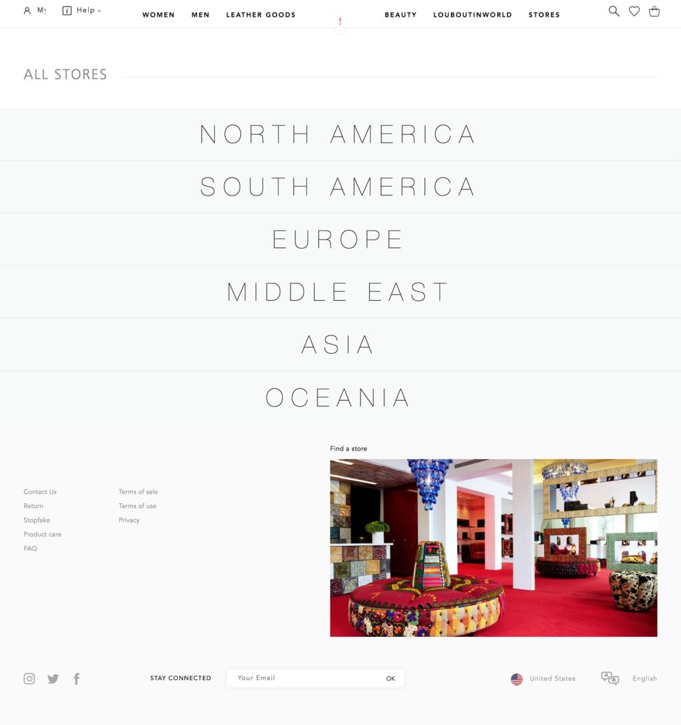
The store locator page (found under the "Stores" tab at the top of the site) allows users to choose their continent and find the brick and mortar store nearest them, and is very straightforward.
A GIF-like animation appears as users hover over each continent. Each animation is customized to each continent's style and culture, which is a unique touch to engage users.
After clicking on one of the continents, the user is shown options for the countries where they have stores. Once a country is selected, the user is shown a list of the stores in different cities.
This experience translates well on mobile, appearing very similar to the desktop version. One simple suggestion would be to enable the site to identify the user's location autonomously, and immediate show stores in their current location.
Christian Louboutin is a clean website design in the E-commerce & Retail, Fashion & Beauty and Luxury industries.


-preview.jpg)