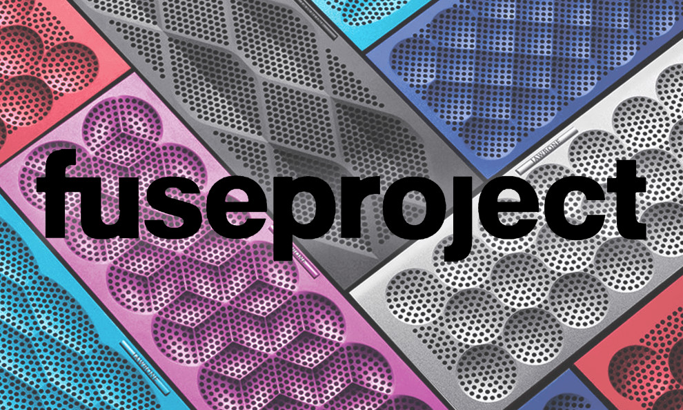
What do you get when you combine colorful fusion with creative designs and epic stories?
You get fuseproject, a branding agency dedicated to bringing stories to life with design. The accent wide, negative space with a vibrant approach, enlisting every color of the rainbow to ensure the website design is fun to look at while you peruse their specialties and work.
Through the homepage, you’re able to view a diverse masonry grid of images as a guide to the kind of work Fuseproject can put out.

With the focus on an innovative business strategy, fuseproject uses visual design to propel and guide you through their website by combining bold fonts and energetic colors. The technique packs a punch in a way that is thoroughly satisfying.
Gradient colors are utilized to divide up page segments and showcase specific areas of interest. Each block of color coordinates effectively with an area on the menu made available at the top of every page.
fuseproject utilizes a common serif font in white to be easily visible against each of the colors shown. The words stand out and are easy to read. Each segment of words is left-aligned and broken down into simplified paragraphs.
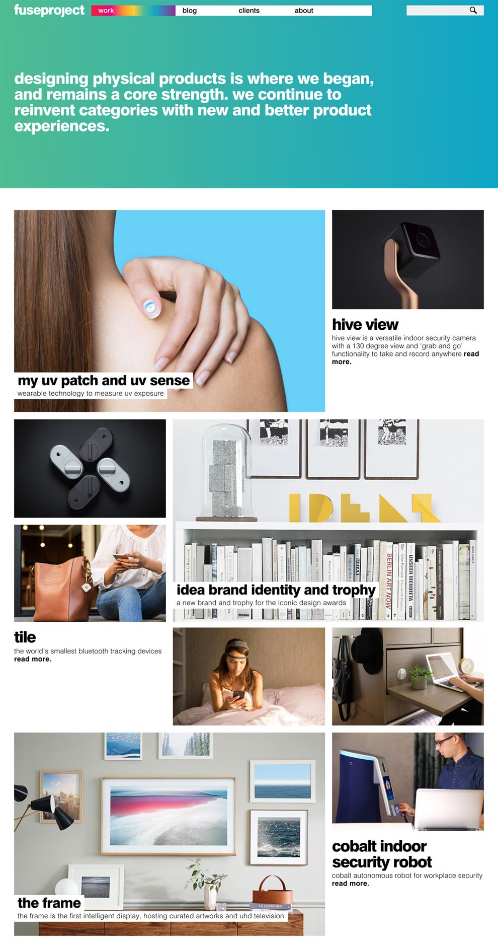
Carrying on the emphasis on color, fuseproject utilizes alternating color schemes to showcase each project. The dynamic combination of sleek images and vivid colors makes each portfolio section “pop” for the viewer. fuseproject offers up a limited amount of information about each project in a faded white font.
The choice allows you, as the viewer, to become fully immersed in the project and let the project speak to you with its own voiceless words. You can see the way fuseproject can work for you through the ways the imagery speaks to you.
The flow of the page is in the eclectic collection of colors splashed across every page. The lack of text and amplification of colors facilitates a deeply immersive experience for users.
fuseproject is a simple website design in the Professional Services and Arts & Recreation industries.


