Best News Magazine Website Designs of 2026
All time Best News Magazine Website Designs of 2026
News Magazine
- Advertising
- Aerospace
- Agriculture
- AI
- Architecture
- Arts & Recreation
- Automotive
- Banking & Finance
- Community
- Construction Company
- Content & News
- Digital Agencies
- Distribution
- E-Commerce & Retail
- Education
- Engineering
- Entertainment
- Fashion & Beauty
- Film Production Company
- Food & Beverage
- Games and Entertainment
- Government
- Health & Wellness
- Hobby
- Hospitality
- Jewelry
- Legal & Insurance
- Luxury
- Manufacturing
- Medical & Pharmacy
- Museum
- Music
- News Magazine
- Non-Profit
- Professional Services
- Real Estate
- Restaurant
- Roofing
- Sports & Leisure
- Startup Business
- Tech Startup
- Technology
- Travel
- Wedding Planning
- Zoo
Select
- 3D
- 404
- About Page
- Artisan
- Artistic
- Black and White
- Blog
- Bold Color
- Bold Font
- Book App
- Check Out Page
- Chinese
- Clean / Minimal
- Colorful
- Contact Page
- Corporate
- Custom
- Experimental
- Flat
- Footer
- Form
- Fullscreen
- Futuristic
- Green
- Horizontal Layout
- HTML5
- Illustrated
- Images / Gallery
- Innovative
- Inspiring
- Interactive
- Landing Page
- Menu
- Microinteractions
- Mobile Websites
- Motion Effects
- One-Page
- Parallax Effects
- Personal
- Pet Store
- Photographer
- Playful
- Podcast
- Pop Ups
- Portfolio
- Pregnancy
- Pro-loaders
- Product Listing Page
- Purple
- Retro
- Services Page
- Simple
- Slider / Module
- Small Business
- Soft Colors
- Sound / Music
- Storytelling
- Tech Online Store
- Typography
- Unusual Layout
- Use of Infographics
- User-Friendly
- UX Designs
- Virtual Reality
- Visible Borders
- Visually Striking
- Webflow
- Welcome Page
- WordPress
-preview.jpg)
Tales Of Ceylon
-preview.jpg)
Salt In Our Hair
-preview.jpg)
Yuriy Vitrenko's Library

Dnevnik

Gordon
-preview.jpg)
RB
-preview.jpg)
ONASA
-preview.jpg)
NJUZ

Inmemoriam
Argentinian Football Association
 Designed byProyectar
Uruguayan Football Association
 Designed byI2ES
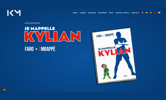
Kylian Mbappé
 Designed byBloody Mary
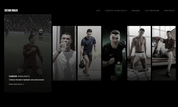
Cristiano Ronaldo
 Designed by7EGEND
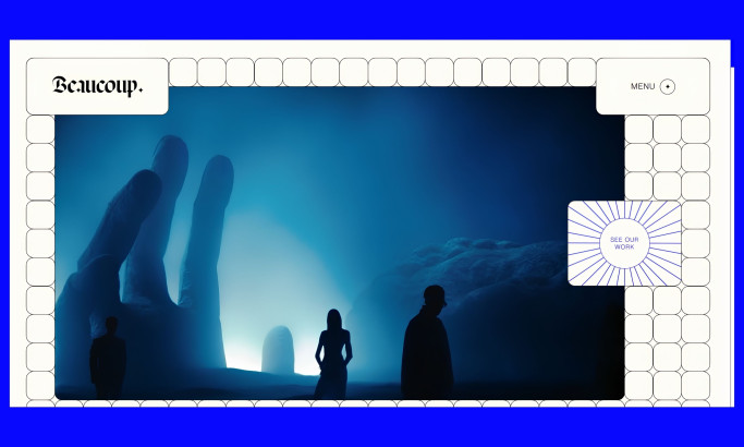
Beaucoup Studio
 Designed byBeaucoup Studio
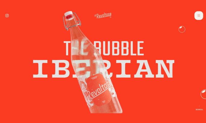
La Revoltosa
 Designed byWaka
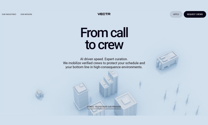
Vectr
 Designed byUtsubo
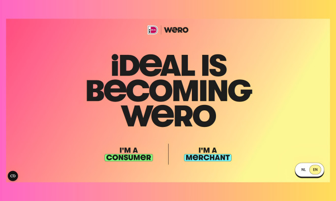
Wero
 Designed by51North
The Design Research Process
Our design research process is a dynamic journey in the ever-evolving landscape of website design. We search the web, contact brands and agencies, and evaluate the designs worthy of being part of our collection. To be recognized among the best web designs, one must master innovation, trends, impact, functionality, user experience, and even branding.
Designs that manage to transcend expectations and take web aesthetics to the next level gain recognition, and the finest among them may advance further and compete for the title of Design Award winner.
If you believe your design embodies these principles, you too can submit it for consideration, contributing to the vibrant tapestry of web design excellence.
Meet The DesignRush Awards Jury


-account-photo_listing.jpg)
-account-photo_listing.jpg)


More Best Digital Agencies Website Designs
View All