


-account-photo_listing.jpg)
-account-photo_listing.jpg)


Our Jury has worked with Prada, Nike, Chanel, Google, and Apple.
Best WordPress Website Designs of 2026
View the Top WordPress Website Designs Below
Best WordPress Website Designs of 2026
4,200+ Submitted Designs
- Advertising
- Aerospace
- Agriculture
- AI
- Architecture
- Arts & Recreation
- Automotive
- Banking & Finance
- Community
- Construction Company
- Content & News
- Digital Agencies
- Distribution
- E-Commerce & Retail
- Education
- Engineering
- Entertainment
- Fashion & Beauty
- Film Production Company
- Food & Beverage
- Games and Entertainment
- Government
- Health & Wellness
- Hobby
- Hospitality
- Jewelry
- Legal & Insurance
- Luxury
- Manufacturing
- Medical & Pharmacy
- Museum
- Music
- News Magazine
- Non-Profit
- Professional Services
- Real Estate
- Restaurant
- Roofing
- Sports & Leisure
- Startup Business
- Tech Startup
- Technology
- Travel
- Wedding Planning
- Zoo
- 3D
- 404
- About Page
- Artisan
- Artistic
- Black and White
- Blog
- Bold Color
- Bold Font
- Book App
- Check Out Page
- Chinese
- Clean / Minimal
- Colorful
- Contact Page
- Corporate
- Custom
- Experimental
- Flat
- Footer
- Form
- Fullscreen
- Futuristic
- Green
- Horizontal Layout
- HTML5
- Illustrated
- Images / Gallery
- Innovative
- Inspiring
- Interactive
- Landing Page
- Menu
- Microinteractions
- Mobile Websites
- Motion Effects
- One-Page
- Parallax Effects
- Personal
- Pet Store
- Photographer
- Playful
- Podcast
- Pop Ups
- Portfolio
- Pregnancy
- Pro-loaders
- Product Listing Page
- Purple
- Retro
- Services Page
- Simple
- Slider / Module
- Small Business
- Soft Colors
- Sound / Music
- Storytelling
- Tech Online Store
- Typography
- Unusual Layout
- Use of Infographics
- User-Friendly
- UX Designs
- Virtual Reality
- Visible Borders
- Visually Striking
- Webflow
- Welcome Page
- WordPress
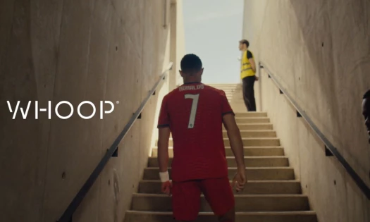
View Design
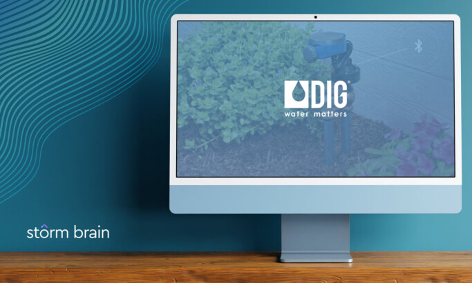
DIG Corp
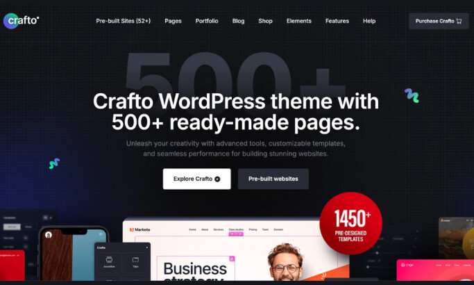
View Design
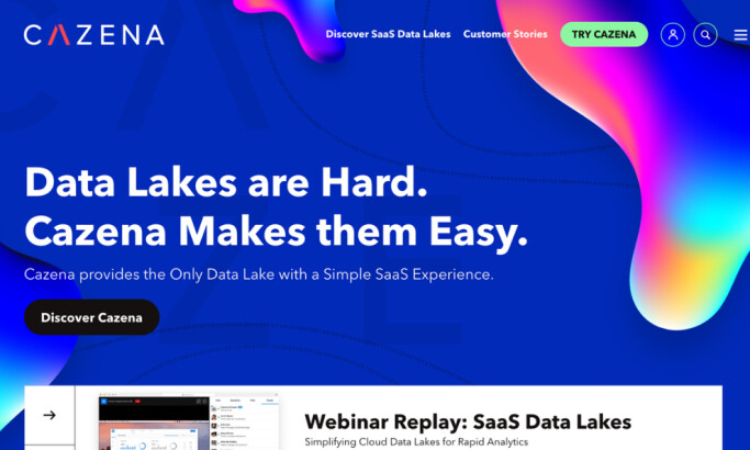
How GoingClear Designed Cazena's Website to Improve Conversion Rates and Sessions

View Design
UC Ranch Properties
Get Connected
With The Right Agency Partner
& Receive Proposals For FREE
Ready to elevate your designs?