Vimeo's website design offers an intuitive video platform for creatives. It exemplifies minimalism, function, and artistry through its high-quality visuals, streamlined navigation system, and responsive UI. Its design elements work together to nail down the brand's creative identity and its vision to provide an online space to showcase captivating video projects.
Key Insights for Brands:
- Utilize minimalism to boost navigation and clarity
- Invest in high-quality visuals for a cohesive brand experience
- Organize content intuitively to enhance usability
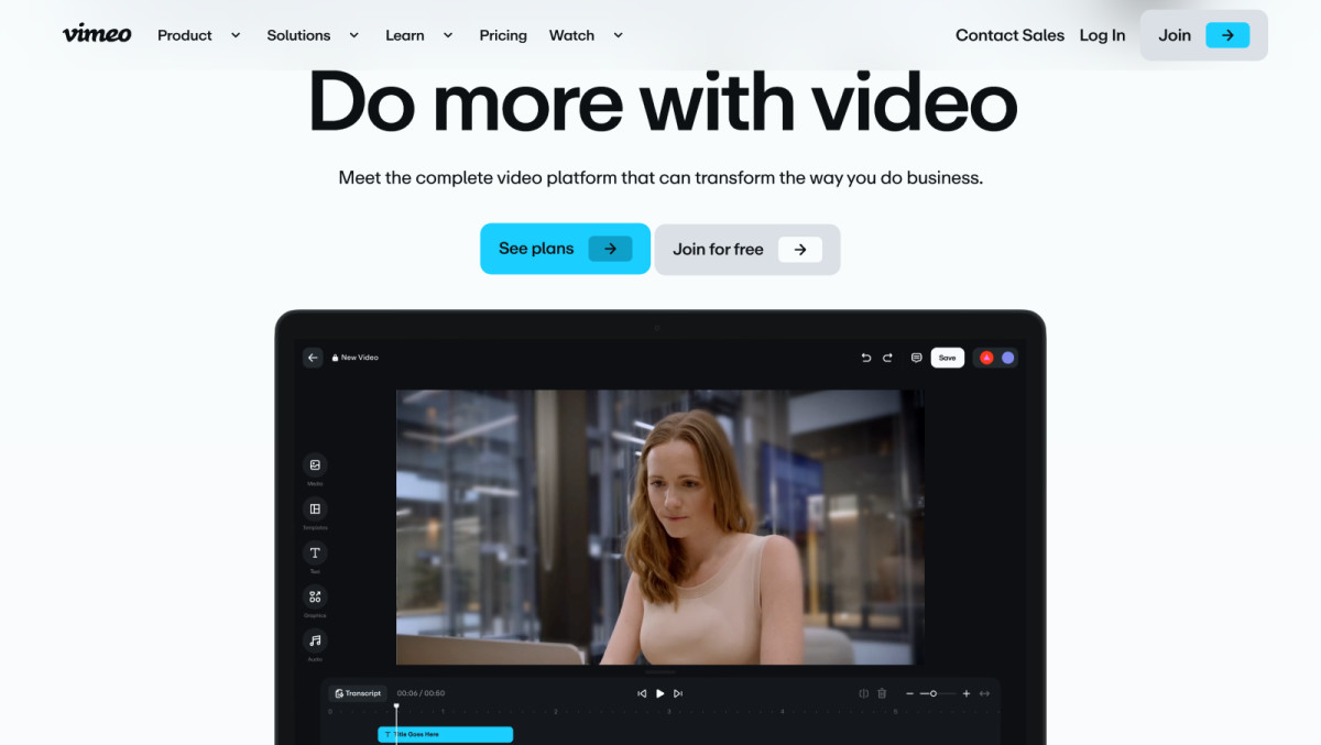
Vimeo’s Website Design Reflects the Art of Minimalism and Functionality
Vimeo's website showcases the perfect balance between minimalist aesthetics and functional design, embodying the platform’s creative spirit. Every element on the site serves a clear purpose, stripping away unnecessary clutter to give users a streamlined experience.
This simplicity doesn’t sacrifice functionality but enhances it, as both creators and viewers can easily navigate Vimeo’s sophisticated tools — like video uploads, browsing channels, or managing content. The well-organized layout ensures that even advanced features remain accessible and user-friendly.
By employing a minimalist website design, Vimeo has also achieved significant performance benefits. The absence of visual distractions allows the website to load faster, offering a smooth experience regardless of the internet speed. This careful balance of design and efficiency not only enhances usability but also reinforces Vimeo’s reputation as a platform that prioritizes both quality and user satisfaction.
High-Quality Visuals and Adaptive UI Enhance Vimeo’s Brand Experience
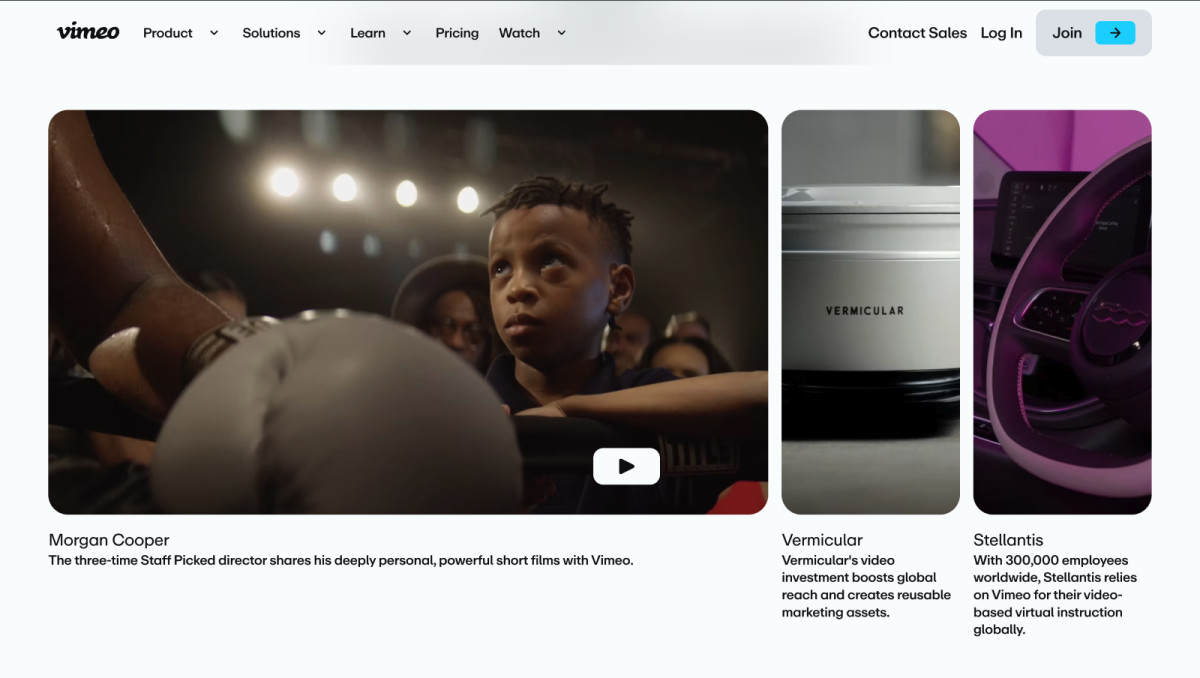
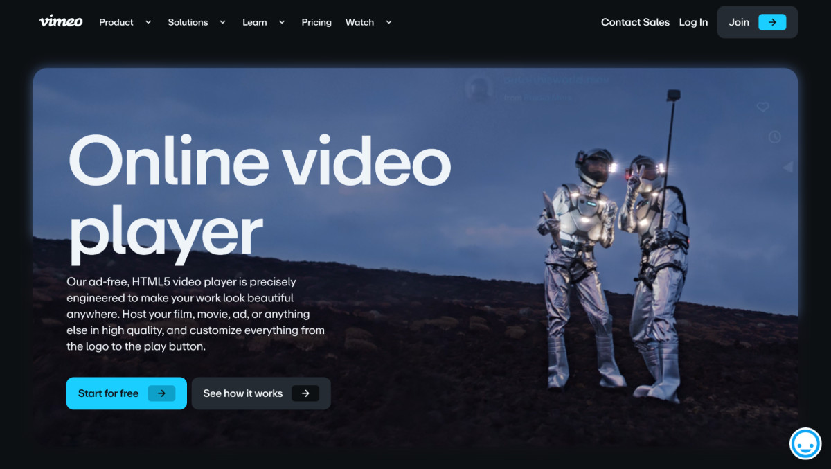
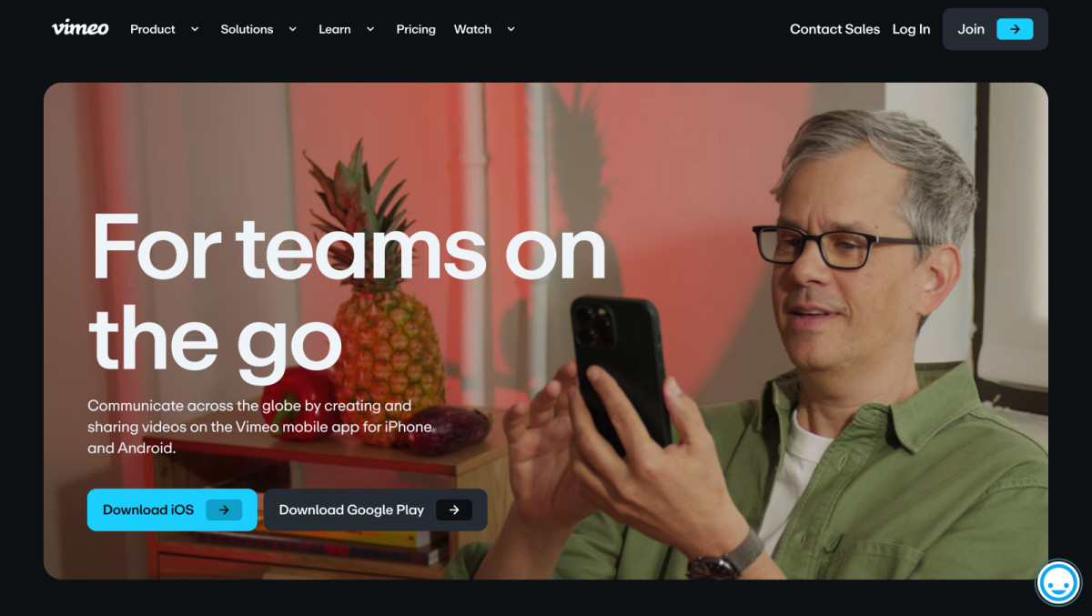
Vimeo’s website design is a seamless extension of its brand identity. It stays true as a visual platform by foregrounding creators’ work from diverse fields and regions, showcasing high-quality visuals that bring global projects to life.
Every visual element, from minimalist typography to vibrant video previews, reflects Vimeo’s focus on delivering a polished experience for its user base of filmmakers, designers, and content creators. Its clean layout and dynamic interface emphasize videos as the central focus, allowing users to easily discover, explore, and engage with a wide array of creative content.
Meanwhile, the site’s adaptive user interface takes this experience further, ensuring they enjoy the same level of performance and visual consistency across all devices.
Vimeo’s dynamic scaling ensures that the design adjusts fluidly to different screen sizes without losing clarity or functionality. Interactive elements, such as hover effects and smooth transitions, create an engaging yet unobtrusive experience, allowing users to explore the site intuitively. This responsive web design enhances Vimeo’s brand experience, offering a visually rich, user-friendly interface that prioritizes both creativity and usability.
Seamless User Navigation Simplifies Complex Features Without Compromising Usability
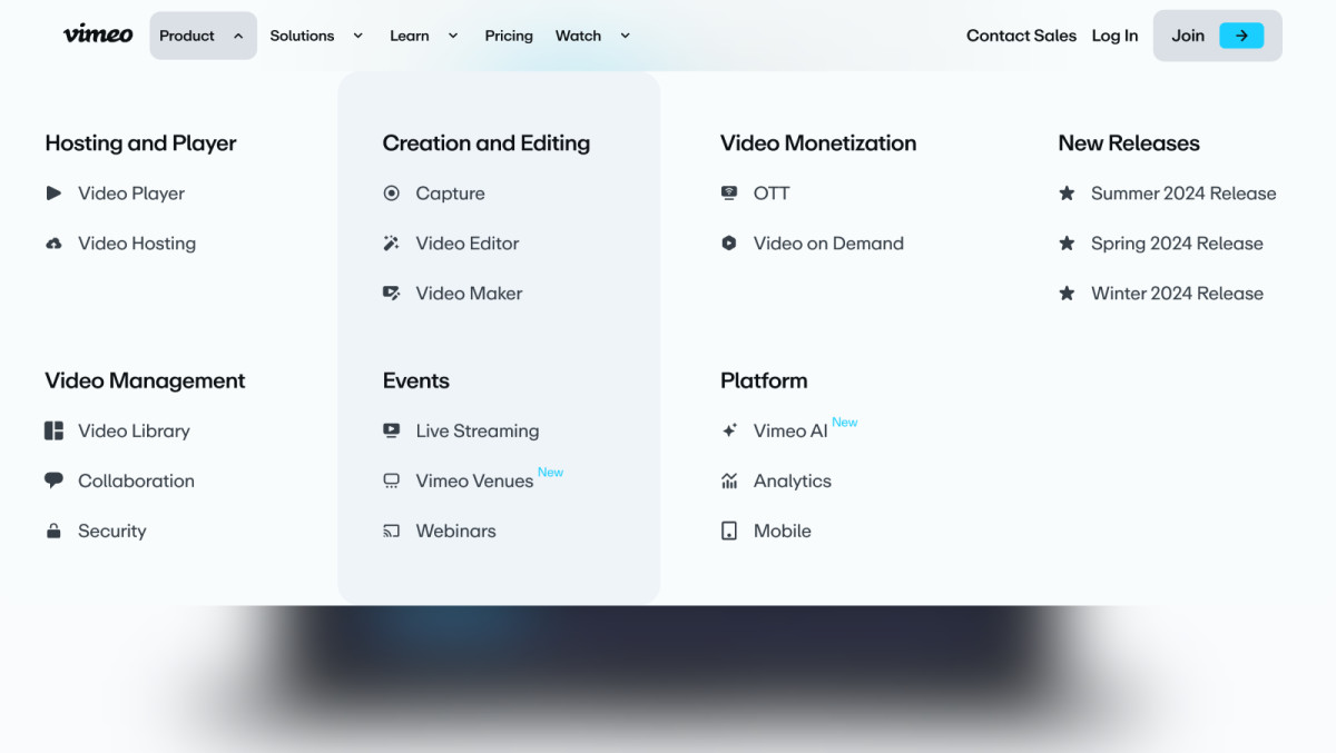
At the core of Vimeo's redesign is a focus on intuitive navigation, ensuring users can find what they need with minimal effort. The restructured navigation bar categorizes essential sections like "Products," "Pricing," and "Solutions," reducing the cognitive load often associated with content-rich sites.
This strategic organization and user-friendly approach, adopted by many professional website design agencies, allows users to navigate the site confidently.
Moreover, the collapsible navigation menu reduces clutter and streamlines the user journey. This design choice allows quick access to essential features without overwhelming the screen, especially on smaller devices.
Vimeo’s clear calls-to-action (CTAs) and strategically placed icons also help users quickly understand the next steps. By encouraging intuitive interactions, the site invites exploration, allowing users to fully engage with Vimeo’s wide range of capabilities without feeling lost or frustrated.
Bold Typography and Restrained Color Palette Anchors Brand Identity and Supports Readability
The Vimeo website’s visual identity is characterized by bold typography and dynamic imagery, reinforcing its brand essence. It features clean, sans-serif fonts that enhance readability and convey a modern and professional tone.
This deliberate choice in typography creates an immediate connection with users, establishing Vimeo as a credible and forward-thinking platform for creative professionals.
Vimeo's blue, black, and white color palette also provides a sleek foundation for vibrant visuals. These colors are a neutral canvas to the platform’s bold and striking imagery, capturing users’ attention and making key elements pop. This contrast enhances visual engagement and reinforces Vimeo’s commitment to showcasing high-quality content.
All in all, the Vimeo website design expertly blends form and function, creating an immersive and user-friendly experience that aligns with Vimeo's commitment to creativity and inclusivity. By prioritizing accessible navigation, bold visuals, and interaction-driven layout, Vimeo sets a high standard in the industry, making it one of the best website designs today.


