
Last Updated: 06/25/2024
The Uber logo embodies the company's vision to innovate and push the boundaries of what's possible in the transportation industry and beyond. It visually represents Uber's core values: connectivity, efficiency, and a relentless pursuit of progress. Additionally, the evolution of the Uber logo reflects the company's growth and commitment to adapting to a rapidly changing world.
Let’s discuss Uber's visual identity and transformation history. We'll analyze how each Uber logo design transformation has captured the spirit of innovation and effectively followed the ever-evolving design trends.
A Brief History of Uber Logo: A Tech Story
Uber is a unicorn startup that sprung up during the tech boom of the late 2000s. Only a few companies are celebrated for shaking up the technology industry the way that Uber has.
For a startup working on ridesharing, design is a distant consideration. Uber, however, saw things differently. The company placed great importance on design and prides itself on its logo to this day.
Let's dissect each logo transformation below!
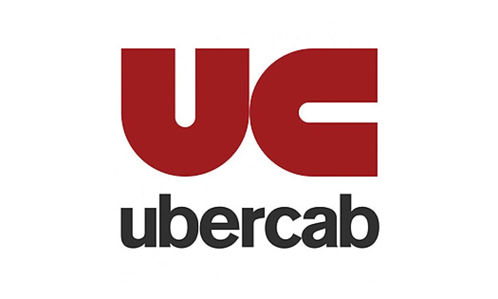
The UberCab Logo
Uber started as UberCab. The company’s logo at this time was a red magnet facing two different directions. The magnet signified the ability of users to summon a private ride at will. In addition, the UberCab logo also appeared like the initials “UC” for UberCab.
That first logo, circa 2010, also featured a black lowercase sans-serif font. The company’s brand name sat atop the initials. The Uber logo changed shortly, eliminating “Cab” from the text. This started the trend towards a shorter, simpler logo.
Browse the top brand naming agencies.
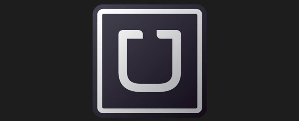
Uber’s 2012 Logo Version
In 2012, Uber underwent another logo change. The new logo shifted radically from the red magnet to a sleek version of the letter “U.” The 2012 logo had elegant, prominent typography. With just a single letter, Uber was able to capture a couple of essential things:
- The company name: “U” is the first letter in “Uber,” which made it easy to associate the logo with the company.
- The company’s motto: “U” also stands for “you.” The new Uber, distinct from UberCab, emphasized its motto, “Everyone’s private driver,” focusing on “everyone.”
Hints of extravagancwe in this logo helped establish Uber as a luxury riding brand. Black is a great background color for this purpose. It’s deep, and the lack of brightness projects authority and breeds confidence. Paired with silver lettering, the combination created a distinct image of luxury.
Dissecting the Bits and Atoms Uber Logo
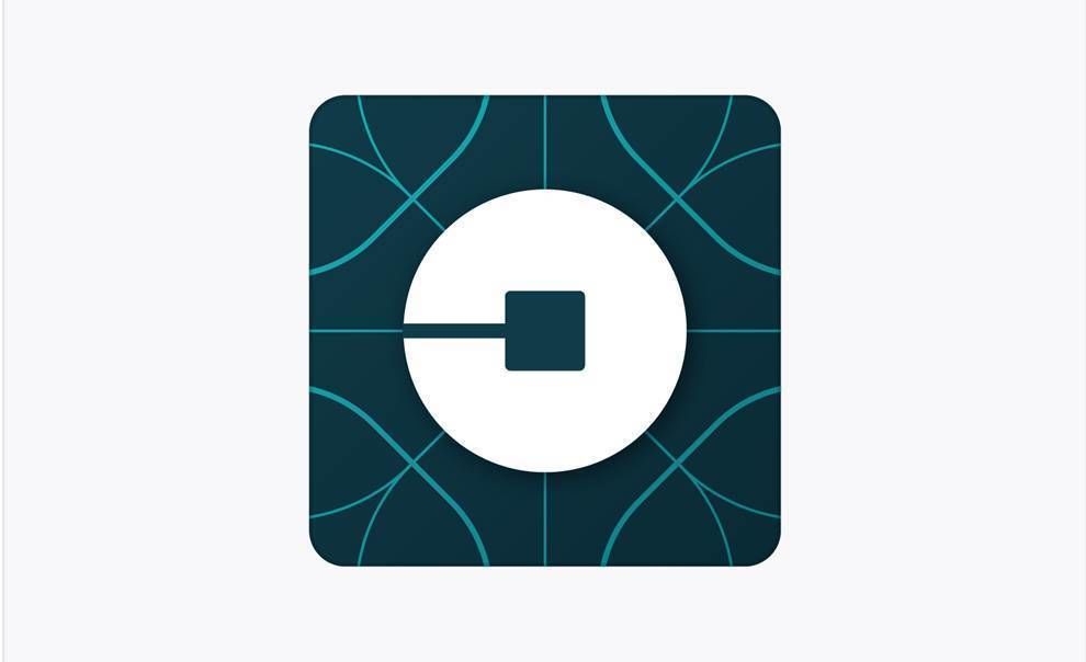
The following Uber logo design, created in 2016, embraces radical change. It ditches the iconic "U" lettering for an ultra-modern and sleek new image.
This Uber symbol is regularly called the "bits and atoms" logo. It shows a bit highlighted in white against the background of an atom, with blue lines crisscrossed in the background. On the whole whole, this Uber emblem displays an element of motion.
The background block is symmetrical, with a lightly etched axis splitting into four quarters. It conveys a scientific precision that casts the company in a positive light. The fleeting imagery of bits and atoms is aspirational and creates an impression of still more great tech to come.
The Latest Uber Logo Update
The current Uber logo, designed in 2018, is a signature wordmark, simply featuring the company name. This new logo was designed by Wolff Olins, and it also appears in a dynamic GIF form, symbolizing motion and progress.
The font, called Uber Move, was inspired by the sans-serif fonts used in traffic signs, emphasizing clarity and direction. The GIF begins with the layout of two roads, which then form the word "Uber," signifying the company's journey towards new paths.
According to Molly Watson, the director of verbal identity at Wolff Olins San Francisco, the new logo was designed to represent Uber’s growth and security.

Uber Logo and Drivers: How They Go Together
Uber also provides vital services to its drivers with its “Uber - Driver: Drive & Deliver” app. The app allows drivers to view specific ride details, navigate easily, and even contact Uber representatives for inquiries.
The logo for this app is a thoughtful extension of the main Uber brand. While it maintains the same recognizable Uber typeface, it incorporates a significant and bold arrow beneath the text.
This arrow resembles the traffic sign for conditional right diversion, aligning perfectly with the Uber Move font. This connects the design to the road, symbolizing direction and movement and represents the core function of the app.
By integrating a universally recognized symbol of direction, Uber communicates to its drivers their main role to safely and effectively guide users toward their destinations.
The combination of the familiar Uber typography with the traffic-inspired arrow highlights the company's focus on clarity and remarkable navigation, reinforcing the message that Uber is committed to providing a seamless experience for drivers and riders.
What the Uber Logo Design Says About the Company
Design has always been essential to Uber’s success. The Uber logo, as the recognizable thumbnail for the app and a key element throughout their website, ensures a seamless user experience and reinforces Uber’s commitment to quality.
The Uber typeface draws a subtle connection between the letters and roads, emphasizing the company's identity as a “mobility platform” rather than just a car-hailing service.
The latest Uber logo reflects the company’s dedication to technological advancement and user service. The new rebranding was a combined effort of consulting firm Wolff Olins, Uber’s in-house brand experience team, and Jeremy Mickel, who designed the new typeface, Uber Move.
The Uber logo is central to the company’s branding and marketing efforts. By carefully crafting the design elements to reflect the company's message, Uber uses the logo to convey their mission and values to customers. According to Uber CEO Dara Khosrowshahi, this design emphasizes movement and the future.
As Uber continues to evolve, the logo will remain a crucial tool in their strategy, pushing the company forward.


