-account-photo_listing.jpg)
-account-photo_listing.jpg)


Our Jury has worked with Prada, Nike, Chanel, Google, and Apple.
Best Brochures Print Designs of 2026
View the Top Brochures Print Designs Below
Best Brochures Print Designs of 2026
4,200+ Submitted Designs- Advertising
- Architecture
- Arts & Recreation
- Banking & Finance
- E-Commerce & Retail
- Education
- Engineering
- Entertainment
- Environmental Ads and Brand Designs
- Fashion & Beauty
- Food & Beverage
- Government
- Health & Wellness
- Hospitality
- Legal & Insurance
- Luxury
- Manufacturing
- Medical & Pharmacy
- Non-Profit
- Professional Services
- Real Estate
- Sports & Leisure
- Technology
- Travel
View Design
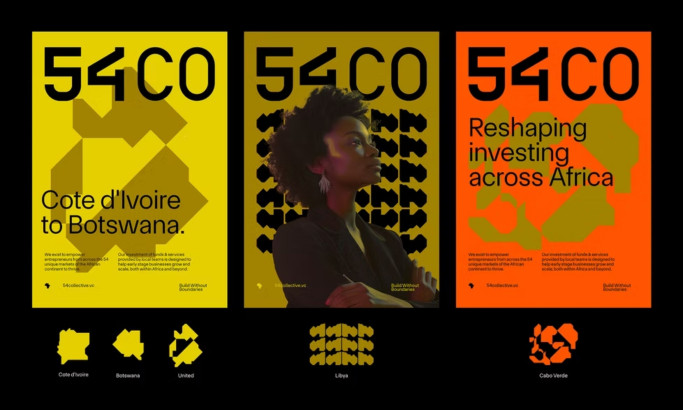
54 Collective Print Design
byBCKRDS
View Design
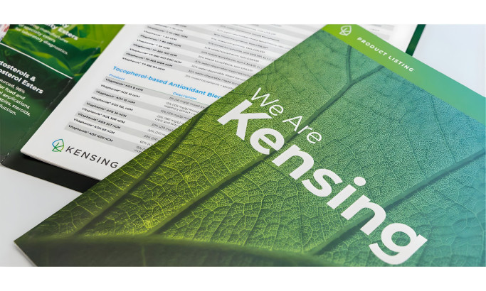
Kensing
View Design
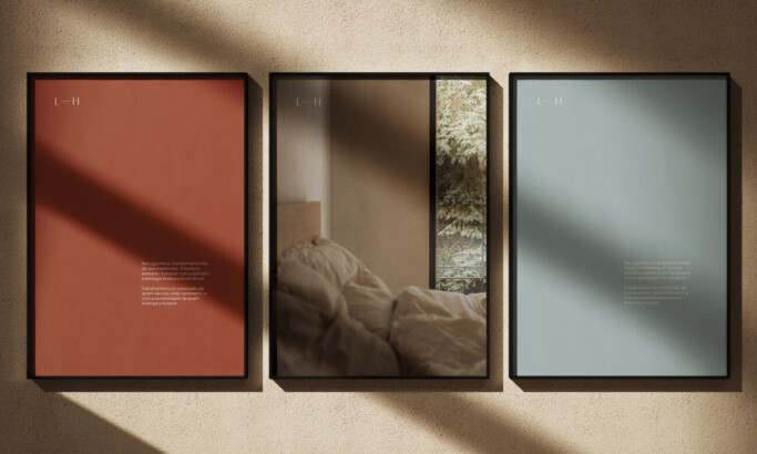
Lugre Haus

View Design
Open Sails

View Design
Festival Vallenato
View Design
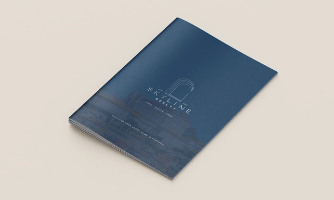
Skyline Realty
View Design
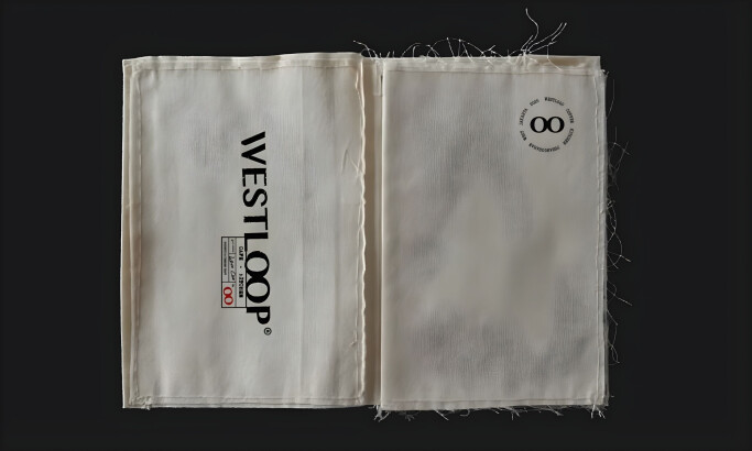
WESTLOOP
View Design
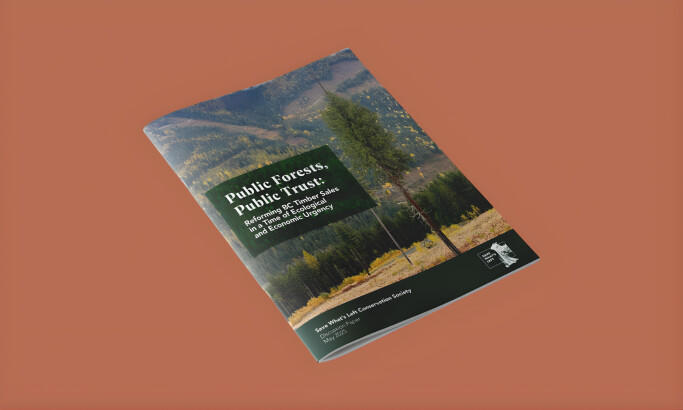
Public Forests, Public Trust Brochure
View Design
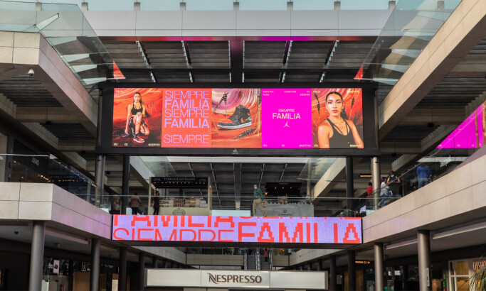
Nike Siempre Familia
Get Connected
With The Right Agency Partner
& Receive Proposals For FREE
View Design
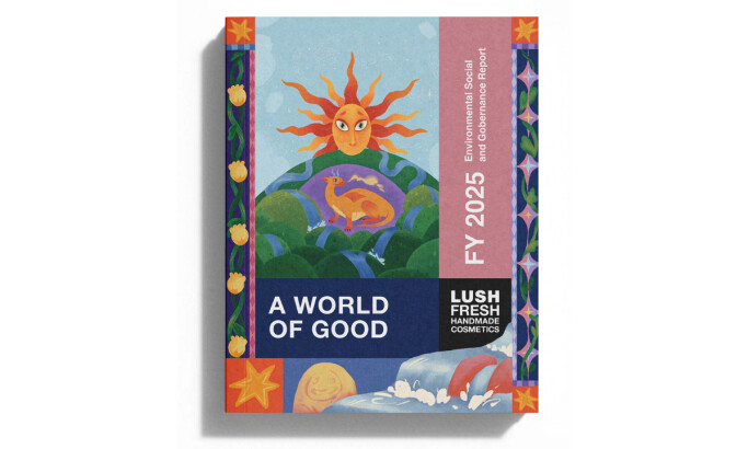
LUSH - ESG Report
View Design
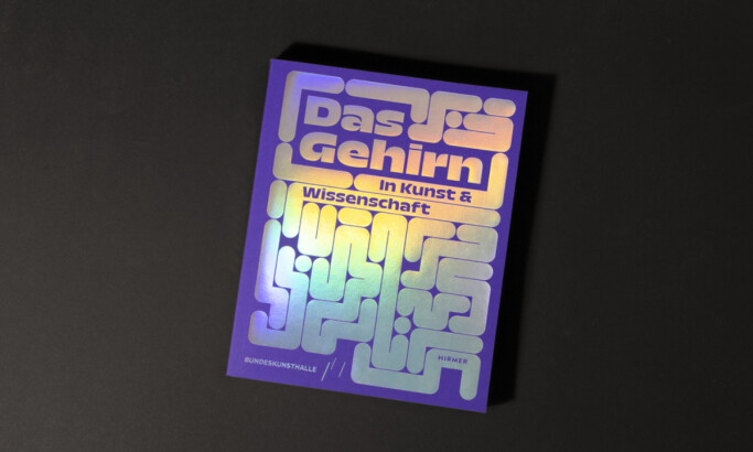
Das Gehirn: In Kunst und Wissenschaft
View Design
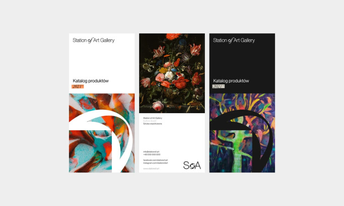
Station of Art — SoA®
-preview.jpg)
View Design
CV Villas
View Design
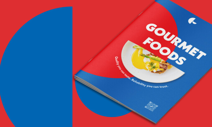
Gourmet Foods
View Design
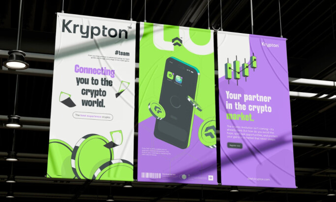
Krypton
View Design
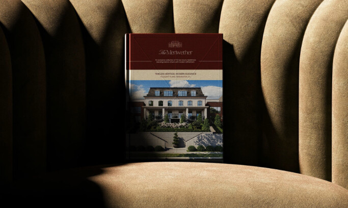
The Meriwether
byHeraphy
View Design
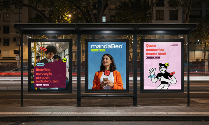
MandaBen – Clube de Benefícios
View Design
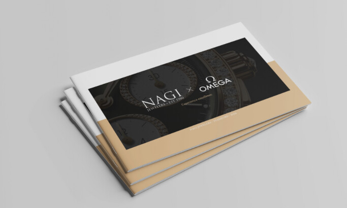
Nagi Jewelers Brochure
Ready to elevate your designs?