
In 2020, there were 111 million food delivery app users in the US alone. By 2025, the industry’s revenue in this market will amount to $42 billion – $14BN more than in 2021!
When you consider that 97% of total food & beverage (F&B) market revenue will be generated through online sales by 2023, it becomes clear that F&B brands’ primary focus should be their digital growth.
And to grow digitally, any business – F&B included – needs a strong app and/or website presence.
Whether you're looking for the best app developers or web design companies to elevate your visual palates, this article looks at some of the most mouth-watering and delectable food & drink apps and websites that generate conversions through engaging UX, easy checkouts, and outstanding visuals.
Table of Contents
Top 5 Food & Drink Delivery Apps
1. Halal Bites by Technource

Standout Features:
- Food finder app
- Fantastic UX
- Map view
True to its name, the Halal Bites app design, developed by Technource, is a delight to consume.
Clean and easy to navigate, this app design helps the Muslim community reach permissible food near them. Thanks to the fantastic UX provided through an intuitive user interface, the design lets the users locate and rate good food, leave pictures, and filter cuisine options via the app.
Finally, there’s also a practical map view that helps the users easily pinpoint the exact locations of their nearby options, so they can filter the restaurants by proximity as well.
2. On Demand Food Delivery By Codiant

Standout features:
- High-quality photography
- Stripped down navigation
- Smart typography
On Demand Food Delivery mobile app, created by software development company Codiant, provides all the convenient features and functionalities that makes ordering food via app so popular: legible online menu, real-time delivery tracking and social media sharing, to name a few.
The most defining and impactful aspect of this particular app is the use of imagery. Vibrant, large-format food photography adorns all app pages – not just menu items – such as opening screens, food categories, restaurant pages and so on.
The contemporary-looking sans-serif typography lends legibility and a touch of coolness to the app’s UI, perfectly contributing to the economical use of copy and messaging.
A very discrete two-tone background, divided diagonally in black and white, addresses this favorable usability with minimum to none distraction.
A very stripped-down commands interface makes navigation remarkably simple. This, as well as a share button, are come in black color which contrasts the colorful imagery convincingly.
3. Food Delivery Mobile App By Ronas IT

Standout features:
- Simple login and ordering process
- Striking accent color
- Lightweight and fast interface
Krasnodar, Russia-headquartered web design and development agency Ronas IT has created their own food delivery mobile app with an emphasis on user experience and user interface.
All the available functionalities – from choosing a restaurant and adding dishes to the cart to making an order and keeping track of delivery – are lightweight, resulting in one of the fastest-loading food & drink apps on the market.
Some of the goals when creating this app were simplifying the ordering process and helping restaurants handle the order volume. Through meticulous user research, the developer has succeeded in this by introducing onboarding guide to the app combined with a quick, two-step login process.
The app’s home screen contains all the main features food order app users have come to expect: restaurant categories, smart search bar, filtering options for sorting by price, distance and other parameters and personalized restaurant suggestions.
All of this comes neatly packaged into a striking color palette with white as the primary hue, assisted by orange (used for highlighting CTAs and other chosen elements), black and grey accents. The easy-to-read Poppins primary font contributes to the minimalistic feel of the interface.
4. KFC Russia Mobile App By Surf

Standout features:
- Augmented Reality-powered 3D images of food
- UI assistant for hands-free orders and personalized suggestions
- Fast checkout flow
Another Russian software development agency on this list, Surf, has rethought the mobile app design for KFC, one of the world’s largest fast-food restaurant chains.
Their fundamental additions to this app were a voice UI assistant for hands-free ordering, a 3D augmented reality menu and an AI-powered smart assistant for personalized suggestions.
As the basics for the new KFC Russia app design, Surf introduced the sans-serif Cena Pro Condensed typeface and black, white and red as the three primary colors.
The multifunctional user dashboard uses the mechanics of Instagram or Facebook stories. It enables users to manage orders and keep up to speed with special offers and loyalty progress. The real-time order details are easily accessible and provide info on time to delivery.
The AR-augmented app even lets users know what their orders will look like through 3D scans of new dishes and special offers. This provides a whole new level of trust-building and emotional resonance with the target audience.
5. Food Delivery App By Tarrea Tolbert

Standout features:
- Clean and simple design
- Old-school icons
- Restrained colors
Work experience with tech giants IBM and Wish has helped digital product designer Tarrea Tolbert to develop one of the cleanest-looking food and drink delivery apps on the market.
Her Food Delivery App design follows the best practices of this specific industry and employs a layout rich with negative space. Light grey, teal and yellow-colored accents are used on call to actions and other notable elements such as selected food categories.
Vector graphics like category icons are also extremely simplistic in their design, almost resembling old-school computer OS icons. Smart search bar at the top of each screen and user menu at the bottom provide a great navigational balance to the user, no matter where they are in the app.
Food Delivery App design facilitates a seamless and time-efficient checkout process. The layout, devoid of any visual distractions, simplifies the ordering sequence to the fullest, resulting in an enjoyable user experience.
Top 11 Food & Drink Websites
1. KMBCH by Outcrowd

Standout Features:
- Pastel color palette
- Product-led dynamic storytelling
- Minimal ingredients illustrations
The first choice for our best food and drink websites list is Outcrowd’s KMBCH. This design puts the brand’s delicious beverages under the spotlight.
The website relies on a palette of various palette tones that emphasize product-led storytelling. The hero section showcases five bottles on a pink screen, each representing a unique taste.
As you start scrolling, you follow the path of a rotating bottle, giving you a deeper perspective of each flavor. Each screen features a background shade that complements the minimal star ingredient illustration placed behind the centered bottle. The scrolling experience rotates the bottle and takes you through several smooth transitions, finally ending with the bottle landing in a six-pack.
2. MILANO WINE CLUB by Naked Studio

Standout Features:
- Stunning, mysterious photography
- Authentic “sign up” button
- Dark-toned background
Next is the MILANO WINE CLUB’s intriguing website design created by Naked Studio. The design assures the visitor that it’s a haven for Milanese wine connoisseurs through its sleek, elegant presentation.
The landing page combines darkness with red wine marks to deliver a distinctive atmosphere for stunning and mysterious photography. It entails a swift description of each section with an inviting visual that prompts you to learn more about the club.
Apart from the fixed hamburger menu, the design’s header encompasses a shy button next to it with a clever copy of “Restricted area,” subtly playing with human psychology and inviting the curious to click it. Once they do, the website takes you to a login/register section, indicating the benefits of becoming a member.
3. Sushi Boom London by Ilya Nasedkin

Standout Features:
- Simple navigation system
- Extensive meal gallery
- Inviting promo video
Ilya Nasedkin ensured that all London-based sushi lovers could get their favorite food quickly and without a hassle. The practical web design for Sushi Boom London is another excellent solution that secured its place on our best food and drinks apps and websites list.
Apart from a clean layout and a soothing blue and orange color palette, this design has a straightforward navigation system. The user interface helps the brand streamline orders through a cohesive and logical roadmap that lets hungry customers input their orders quickly.
The design also contains an extensive meal gallery so you can get a glimpse of the items on the menu before ordering, as well as an inviting promo video that showcases the restaurant’s interior.
4. The Granola by Foodie Marketing

Standout Features:
- Sweet single-page website design
- Abundant positive space
- Enticing product videos
If you’re looking for a healthy savory vegan meal in Australia, The Granola’s got you covered. In line with the products’ funky vibes, Foodie Marketing developed a delectable web design for the brand.
This sweet single-page design is simple. Without any intrusive visuals and pathways, the design uses an abundance of positive space to introduce the brand through short content chunks on the screen. It opens with a family photo of children at a table with the product in front of them.
However, as you scroll, the website adds soft colors to the screen and proceeds to promote each of the three taste varieties of the product. Each segment entails a swift product description and a short video that makes your mouth water.
The only buttons on the website take you to the shop where you can order delicious granola.
5. Saucy Rebellion Website by Upstart Food Brands

Standout Features:
- Mouthwatering carousel
- Heavy typography
- Grainy visuals
Upstart Food Brands is behind our next pick for the best food and drink apps and websites list. We need to talk about the fiery Saucy Rebellion website design.
The hero section presents a mouthwatering carousel with appetizing photography and a heavy white typeface.
The custom font style is present across the design, and it’s difficult to miss due to its increased size and bolded presentation.
Apart from spicy burning red and flame illustrations, this design also encompasses colorful grainy dots as an addition to the background and the product photography in the shop.
6. Doc Popcorn by Groove Commerce

Standout Features:
- Colorful and funky
- “Corny” visuals
- Featured products carousel
The following entry on our best food and drink apps and websites is Doc Popcorn’s website design crafted by Groove Commerce.
This design is colorful and funky, combining happy orange, yellow and green hues with tiny stickman figures that accompany the photos on the layout. The mid-section of the landing page contains positive space that helps the sparse content stand out next to large images.
Underneath the hero section, you can browse through a carousel of the most popular products through an aerial popcorn view. Each entry triggers a cursor effect that shakes the popcorn, making it dance in front of you!
We give bonus points to this design for the “corny” visuals – we see singled-out popped corn decorating the images in their angles, preserving the design’s all-around corn identity.
7. Daily Menu Food Delivery By CityTech

Standout features:
- Calendar for planning meals
- Bold CTAs
- Intuitive user journey
Daily Menu website is a brainchild of a Delaware-based web design agency CityTech. It is a health-oriented portal with daily nutrition plans, recipes and fast food delivery.
The space above the fold is reserved for hi-res images of the current day’s breakfast, lunch and dinner plan. A prominent, rounded CTA button in vibrant yellow invites users to add the selection to their cart. Sticky navigation menu on the top of the page is separated into two halves with the centralized Daily Menu logo.
A calendar function provides insight into the online restaurant’s future meal plans so that users can plan their nutrition ahead. Unique value propositions such as different meals every day, organic products only and a money-back guarantee are prominently displayed on the website.
The entire websites relies on white, black and yellow as brand colors, aided by the professionally-shot images of intricate dishes and food. The typography is kept simple as well, with undefined sans serif varieties acting as the website’s primary and secondary typography.
8. Gritz Brewing eShop By All Creative

Standout features:
- Micro-animations and dynamic effects
- Custom illustrations
- Great-looking product pages
Gritz is an Italian brewery that produces gluten-free craft beers. Their website, designed and developed by All Creative agency, is the expansion of the branding work they have conducted for this client.
The website is tailored according to the brewery’s specific requests and delivers a smart and intuitive user experience. Beautiful label illustrations of each brew’s bottle is fully integrated into the website’s design, starting with the opening screen of bottles lined up against the gritty light brown background.
Logo’s vintage-looking script font fits in nicely with the more conservative and formal sans-serif typeface used for the website’s copy. Each product has a dedicated page that follows visual cues found on its label.
The amazing attention to detail is especially apparent in small, animated beer icons that accumulate according to the selected quantity of bottles when the user adds them to the cart. This not only provides the most welcome eye candy, but also facilitates the shopping experience as shoppers can keep track of the quantity of items easily.
Dynamic microinteraction effects like bubbles rising upwards while scrolling create an immersive experience that users wish to engage with for prolonged periods of time.
9. Maison Éclat By Caspar Eberhard

Standout features:
- Interesting main menu effect
- Bold use of unconventional colors
- Thoughtfully executed product pages
Caspar Eberhard’s website design for Maison Éclat, champagne connoisseur website and eShop, takes a radically different approach compared to all the previous entries on this list.
Instead of soothing and restrained tones, a very vivid, electric green comes charging from the get-go, acting as a frame for the opening (somewhat arty) image.
The main menu is again divided into a left and a right half with the brand logo at the center. Hovering over one menu item opens a drop-down submenu with an interesting effect – the colors/light of the rest of the sight go dim.
As the user scrolls down, the website goes from green to white and the main menu also turns into its inverse/negative version. The product pages focus on high-res photos of the champagne bottle, its name and its price all on a single screen.
Once the user scrolls, more valuable product information is located on the left, while the Add to Cart button occupies the right hand of the screen. A bevvy of similar products is located at the very bottom, so as not to distract the shopper from their journey towards conversion.
10. MacCoffee Cappuccino Di Torino By Kruchenas

Standout features:
- Fully gamified user experience
- Attention-grabbing full-screen video
- Option of sharing a personal gamified product on social media
Kruchenas’ website for MacCoffee Cappuccino Di Torino is a unique entry in this list as it uses gamification to attract, engage and retain its visitors.
The website’s opening sequence has a full-screen video in the background, telling a story of a young woman’s morning routine (that involves a cup of foamy MacCofee Cappuccino) taking a comically dramatic turn.
The twist here is that, in order to proceed to the main portion of the website, a user has to draw a circle with their mouse/trackpad “to make coffee”. This activates the main single-page website that also comes with a series of similar gamified tasks. Completing them takes the visitor through different stages of their user journey.
With each completed task, the accompanying messaging explains the benefits of this product, which finishes with adding the chocolate powder to the cup – also shareable via the user’s social media.
By mimicking the process of making a cup of coffee in a virtual environment, MacCoffee Cappuccino Di Torino's website manages to prolong the average time on site durations for each visitor.
11. Fortune Oysters By Dose Media
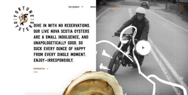
Standout features:
- Plenty of details and Easter eggs
- Intertwining images and videos
- A look that aligns with the brand’s persona
Dose Media’s website for Fortune Oysters reflects Nova Scotia’s seafood producer’s youthful and rebellious brand identity. The garish yet muted tone of its illustrations, images, and videos emphasize the product and the enjoyment associated with it.
As the visitor scrolls down primarily the black and white site with brown accents, hidden Easter eggs will appear when the mouse cursor hovers over certain parts for unexpected interactive elements. These scrolling trigger effects and discrete animations make this one of the most detail-oriented websites on this list.
The main menu navigation at the top of the page moves to the top right when the visitor scrolls down and adopts a more compact hamburger menu form.
Slightly gritty sans serif typography is on-brand and quite legible, especially in headings and taglines that come in massive-size fonts. The contrasting color palette makes the website easy to navigate, with all the right elements popping out quite visibly in front of the visitor.


