-account-photo_listing.jpg)
-account-photo_listing.jpg)


Our Jury has worked with Prada, Nike, Chanel, Google, and Apple.
Best Eco and Sustainable Packaging Designs of 2026
View the Top Eco and Sustainable Package Designs Below
Best Eco and Sustainable Packaging Designs of 2026
4,200+ Submitted Designs
- Advertising
- Arts & Recreation
- Automotive
- Bread
- Chocolate
- Condiment
- Condom
- Dairy Product
- E-Commerce & Retail
- Eco and Sustainable
- Entertainment
- Fashion & Beauty
- Food & Beverage
- Frozen Food
- Health & Wellness
- Honey
- Hospitality
- Jewelry
- Luxury
- Manufacturing
- Medical & Pharmacy
- Medicine
- Olive Oil
- Pet Food
- Skincare
- Soap
- Spirit
- Sports & Leisure
- Technology
- Toys and Games
- Travel
- Watch Branding
- Wine
View Design
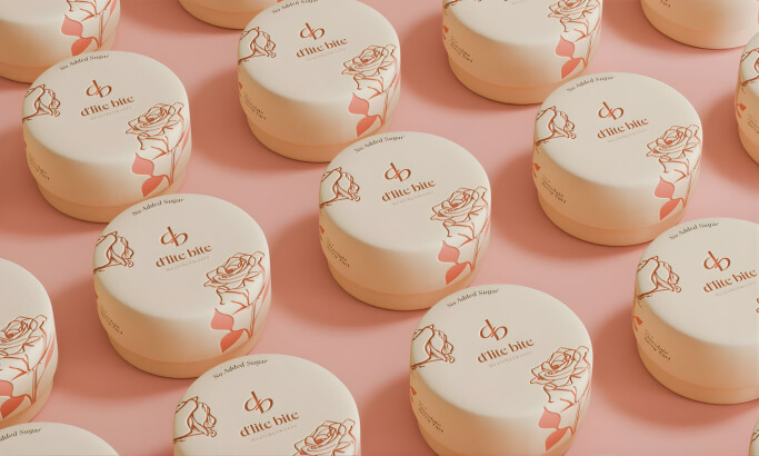
d'lite bite
-preview.jpg)
View Design
Dwell Dripper for Verve Coffee Roasters
byZenpack

View Design
The North Face
byBBMG
-preview.jpg)
View Design
EarthProof Protein Packaging

View Design
Alter Eco
-preview.jpg)
View Design
Hydrogen Europe’s 2021 Report
byREVOLVE
-preview.jpg)
View Design
Sendle Sticker
Get Connected
With The Right Agency Partner
& Receive Proposals For FREE
Ready to elevate your designs?