


-account-photo_listing.jpg)
-account-photo_listing.jpg)


Our Jury has worked with Prada, Nike, Chanel, Google, and Apple.
Best Juice Package Design of 2026
View the Top Juice Package Designs Below
Best Juice Package Design
4,200+ Submitted Designs- Advertising
- Arts & Recreation
- Automotive
- Bread
- Chocolate
- Condiment
- Condom
- Dairy Product
- E-Commerce & Retail
- Eco and Sustainable
- Entertainment
- Fashion & Beauty
- Food & Beverage
- Frozen Food
- Health & Wellness
- Honey
- Hospitality
- Jewelry
- Luxury
- Manufacturing
- Medical & Pharmacy
- Medicine
- Olive Oil
- Pet Food
- Skincare
- Soap
- Spirit
- Sports & Leisure
- Technology
- Toys and Games
- Travel
- Watch Branding
- Wine
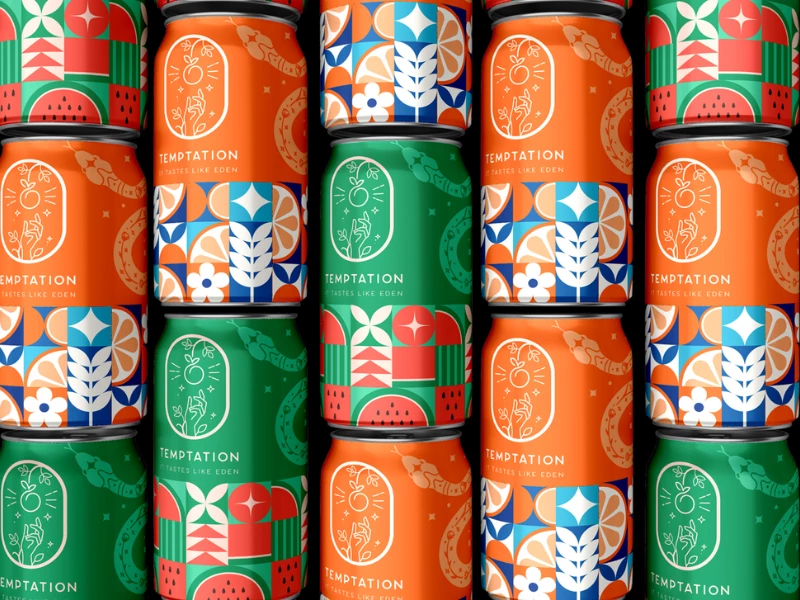
View Design
Temptation Juice
_c414b8bba63d-preview-webp.webp)
View Design
Groovy
_637d20085dee-preview-webp.webp)
View Design
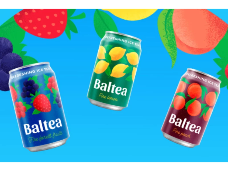
Wild & Raw
byDigiwits
_3035087c256c-preview-webp.webp)
View Design
Fruit Journey
View Design
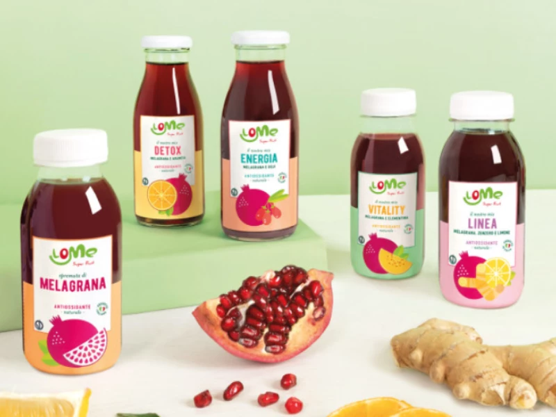
Lome
View Design
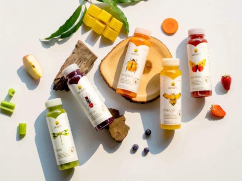
Doi Kham
View Design