The Opportunity Agenda Web Design Boosts Its Narrative Through Slick Visuals and a Unique Take on Dark Mode
Over a quarter-century ago, the Opportunity Agenda (TOA) was founded as a vital, long-time resource for various progressive organizations aiming to sharpen their message training. When they underwent a transformative, structural shift to focus on combating (re)emerging white supremacy, they needed a brand that reflected the new focus.
This called for the creation of a fresh new brand, a visually impactful social strategy, and most importantly – a responsive, engaging website that perfectly reflects the organization's mission and priorities. Enter Outright!
TOA’s website redesign is a complete overhaul of their digital presence, one that incorporates a cutting-edge information architecture, a masterfully crafted search function, and a holistic catalog of page templates with modular components.
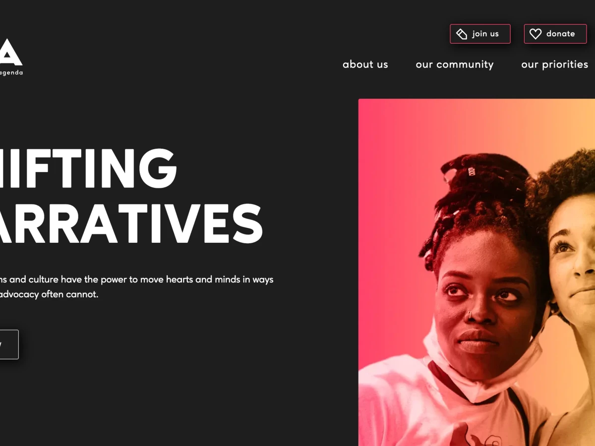
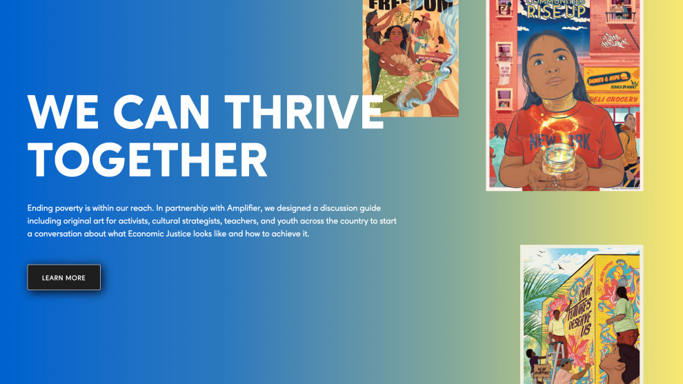
But what stands out the most is the agency’s use of color (or lack thereof). The site succeeds in the impossible, embodying the brand’s mission with a fully immersive dark-mode UI emphasized by striking and color-rich accents and imagery. The result is a digital platform that truly mirrors the mission and organizational priorities, inviting users to engage with a powerful narrative with ease and understanding.
More and more professional web designers jump on the dark mode trend as it enables accessibility and focus on content while reducing eye strain. Not to mention that it simply looks better.
Explore more striking dark-mode web designs here.

TOA’s Website Design Opts For Clear-Cut Minimalism and Bold Typography to Underline the Brand’s Message
Minimalism in web design has become common practice in recent years, however, by harnessing its full power and combining it with bold, sans-serif typography, Outright morphed the website into a work of art.
By stripping away unnecessary clutter, its minimalist design emphasizes the essence of a message, allowing it to shine in a world that often draws conclusions from the black-and-white perspective (hence the dark mode). Bold typography, in turn, amplifies the impact of TOA’s key message, making each informational paragraph and key statement visually arresting and memorable.
Together, these elements create a harmonious synergy. Elegant simplicity and improved readability drive positive change by fostering user experience that is emotionally resonant and ultimately, aligned with the TOA’s values.

Website Cuts Confusion With Subtle Interactive Elements and Clear Calls-to-Action
A clear highlight of the Opportunity Agenda’s website is that it finds a way to make its point across wherever visitors land. Transitions that take you from page to page or to different sections are smooth, fluid, and fun.
This shows that Outright did well when researching the brand’s audience: An entirely dark mode design, “painted” with an evocative gradient palette, f, fueled by an advocacy narrative targeted at the GenZ audience that desperately seeks to unite leisure with socially conscious goals.
Navigation is simple and it takes just a few clicks. Design lets the website speak for itself. The ultimate test of that statement? Calls-to-action (CTAs). They are unmissable and the subtle interaction (by hovering over them) is yet another taste of how minimal effort can move mountains when you’ve set your mind on it.
There are no confusing explanations, no chaotic drop-down lists, just simple and clear CTAs.
Explore more websites with compelling call-to-action here.
The Opportunity Agenda’s Website Design Is Responsive in More Ways Than One
TOA's website showcases responsive design crucial for delivering a consistent and user-friendly experience across various hand-held devices, simultaneously enhancing engagement and reducing bounce rates.
It seamlessly adapts to different screen sizes and resolutions without compromising its eye-pleasing layout.
However, it's not only responsive in the traditional sense but also adaptive in its commitment to fostering positive change.
TOA effortlessly breaks the mold, and newly established stereotypes of "woke" culture by adhering to the sense and sensibility of all, bridging the black-and-white divide with beautiful colors.
Ultimately, it is bound to grow a wide audience and maintain a competitive edge in the digital realm - a key ingredient that differentiates Design Award winners from the rest.