Our experts did the research and curated standout web designs that businesses can learn from. Below are 25 examples handpicked by our team — most of which have earned DesignRush’s Best Website Design award.
If you’re looking to build a custom website, we’ll guide you through the ins and outs of custom website development and share key insights to help you get started.
Why Choose Custom Web Design Over Templates?
Template-based websites offer a quick and budget-friendly solution, however, they come with limitations in scalability and uniqueness. In contrast, custom web design goes beyond the limitations of off-the-shelf templates by providing a fully tailored solution that aligns with your brand identity and business goals.
Unlike templates, which use pre-made themes and generic layouts, custom designers build your site from scratch — ensuring every detail and element is developed specifically for your brand to deliver a unique and compelling digital experience. This includes:
- Unique layout and navigation: Crafted to guide visitors smoothly through your content, delivering an intuitive user journey
- Tailored color palette & typography: Aligned with your brand’s personality to create a cohesive look
- Optimized content flow and graphics: Designed specifically to engage your target audience and highlight your value proposition
- Exclusive visual elements and imagery: No stock layouts — everything is exclusively created to make your brand stand out.
When Is Custom Design Right for You?
Not every business needs a custom website, but if you want more than just a basic online presence, investing in a tailored web design could be the right move. Here are key scenarios where a custom web design is the better choice:
You want a truly unique brand identity: Rather than blending in with generic themes, your custom site becomes a true reflection of your brand’s distinct identity.
- You want to outshine the competition: A unique, custom-made website ensures you won’t share a design with many brands and blend in with the competition.
- You need a modern, fresh look: A well-designed site grabs attention and boosts engagement and customer retention, thus improving search engine performance.
- You aim for higher conversions: A site designed with your target audience in mind can significantly boost conversions, sales, and revenue.
- You want to refine the customer journey: A strategically developed design helps guide users through a conversion funnel optimized for generating leads and sales.
While custom web design typically requires a larger investment compared to pre-made templates, the long-term benefits — enhanced brand identity, improved user engagement, and a conversion-optimized experience — can far outweigh the initial cost.
Ultimately, choosing a custom solution means you’re investing in a digital experience that’s as unique as your business.
What You Can Learn from the Best Custom Web Designs
Custom web design is more than just creating a website — it’s a strategic approach to building a digital presence that directly addresses your business needs. By exploring these diverse examples, you'll see how custom design can enhance storytelling, drive conversions, deliver minimalist clarity, engage users interactively, and mobilize communities.
Below are some of the best custom web designs that demonstrate these principles in action:
- Narrative & immersive storytelling
- Conversion-focused eCommerce
- Minimalist and clean aesthetics
- Interactive and engaging experience
- Purpose-driven and community-based
Narrative & Immersive Storytelling
When a brand’s history or message is at the core of its identity, designs that weave immersive narratives capture attention and forge an emotional connection.
- TECNAM
- The Boat
- HITPARADE.CH: 50 Years Swiss Music Charts
- The Economist: Tracking Energy
- CEREMONY Coffee
1. TECNAM
Featured in DesignRush Best Designs
Designed by Digital Silk | Agency Profile
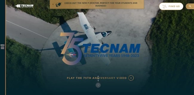
Tecnam, an Italian aircraft manufacturer founded in 1948, is renowned for its next-generation piston planes. The company commissioned Digital Silk to develop a website that effectively highlights its rich history and significance.
The agency utilized its innovative motion graphics “scrollytelling” technique, incorporating a horizontal timeline, creative integration of aircraft models, engaging videos, and high-quality photos to create a site that is both functional and visually striking. Moreover, the carefully selected fonts and color scheme mirror the exclusivity and luxury expected from an aerospace brand.
For businesses planning a custom design, this example underscores how dynamic storytelling elements can effectively convey brand heritage while maintaining excellent usability. This website also highlights the importance of aligning visual elements with brand identity, ensuring that responsive design keeps your message consistent across all devices.
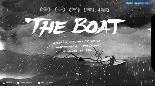
2. THE BOAT
Featured in DesignRush Best Designs
-content-large-webp.webp)
-content-large-webp.webp)
To say that SBS did a great job on their first graphic novel would be an understatement and they have the awards to prove it. The website features immersive storytelling that is both emotional and intriguing. The use of sketches, animations, voice-overs, and sound effects transforms the narrative into a compelling page-turner, delivered in an engaging deep scroll format.
The overall design concept and execution are works of art. It clearly illustrates how layering multimedia elements can captivate users and enhance engagement, setting your project apart from standard templates.
Let this serve as inspiration to invest in creative, tailored solutions that offer a unique user experience and tangible business value. When consulting with providers, ask for examples of multimedia integration that drive engagement.
3. HITPARADE.CH: 50 YEARS SWISS MUSIC CHARTS
Featured in DesignRush Best Designs
Designed by Hinderling Volkart
-content-large-webp.webp)
-content-large-webp.webp)
Hit Parade takes audiences on a musical journey through time and space. While the content could have been presented through a simple list with interactive buttons, the website elevates the experience by creatively interpreting constellations and the galaxy. Though the charts are based on Swiss rankings, the universal appeal of music ensures the experience resonates with a global audience.
This example showcases the value of custom web design in transforming ordinary content into an immersive, unforgettable visual experience. By utilizing motion graphics, data visualization, and interactive elements, your website can break geographical barriers and enhance user engagement — an essential insight for businesses looking to expand their reach through a tailored online presence.
4. THE ECONOMIST: TRACKING ENERGY
Featured in DesignRush Best Designs
-content-large-webp.webp)
-content-large-webp.webp)
-content-large-webp.webp)
The Economist proves that big data doesn’t have to be boring. This microsite tracks energy usage per U.S. state per year. Although the site shares in-depth research on the topic, visitors are not riddled with information. Users can intuitively locate the necessary information and discern patterns seamlessly on a single page — all thanks to a well-designed, interactive user interface.
For those looking for custom website design, this example underscores the importance of crafting a user-centric interface that presents complex data in an accessible and engaging manner.
5. CEREMONY COFFEE
Featured in DesignRush Best Designs
Designed by DRXLR | Agency Profile
-content-large-webp.webp)
-content-large-webp.webp)
-content-large-webp.webp)
Ceremony Coffee Roasters, a local coffee brand from Maryland, U.S.A., instantly conveys its passion for coffee and its community through a thoughtfully designed, minimalist website.
The overall design is light and easy on the eyes, setting it apart from traditional coffee sites. Ceremony Coffee Roasters uses a refreshing pastel color palette, making its product images pop. This highlights how a fresh visual approach can set your brand apart from industry norms.
What makes this design particularly noteworthy is its innovative presentation. Coffee products are showcased alongside complementary elements like fruits, nuts, and desserts, creating a multisensory experience that helps customers better understand flavors and pairings.
Use this example as inspiration when designing your website — it serves as a guide on how to integrate unexpected yet relevant visual storytelling cues to clarify complex product characteristics.
Conversion-Focused eCommerce
Custom design can streamline the buyer’s journey by presenting products in a way that drives action and converts visitors into customers.
6. G PEN
Designed by Digital Silk
-content-large-webp.webp)
-content-large-webp.webp)
G Pen is a brand of vaporizer that smokes other brands in the CBD industry, thanks to its well-designed online store by Digital Silk. The website is rich with high-quality product shots, as expected from a retail brand. What truly distinguishes this eCommerce design is its meticulous focus on the conversion funnel, ensuring every step of the user’s journey is optimized for engagement and purchase.
For instance, live chat and FAQs provide instant support for any shopping concerns, while the Add To Cart button is highly visible, keeping the buying process hassle-free. Additionally, customer reviews and newsletter subscriptions encourage ongoing engagement and brand loyalty.
The web design also reinforces the brand’s value by presenting all the essential product information in the most visually engaging way, helping to justify its pricing. If your brand needs a standout eCommerce site, this example serves as a great role model, showcasing the value of designing clear conversion pathways and accessible support elements — key factors in building customer trust and driving sales.
7. WARBY PARKER
Featured in DesignRush Best Designs
-content-large-webp.webp)
-content-large-webp.webp)
-content-large-webp.webp)
Warby Parker is an eyewear company that revolutionized the optical industry. What started as an online venture grew into brick-and-mortar stores across the US and Canada. Their secret? Affordable products, trendy styles, and a well-designed website.
Their eCommerce site is simple, fun, and user-friendly. Just like a good pair of glasses, the website complements the brand personality. With a clean layout free of excessive copies or cluttered images, the website stays stylish without trying too hard.
Its most notable feature is the integration of the Home Try-On feature, which lets customers try the products at home for free. And just like the rest of the website, the checkout and return process is also a breeze. With the buyer's needs in mind, Warby Parker has created a seamless brand experience that bridges both online and offline shopping.
Overall, this website highlights the impact of seamlessly integrating innovative features to create a one-of-a-kind user experience and build lasting customer loyalty. When evaluating providers, consider asking: “How have you integrated custom features that enhance both online and offline brand experiences?
8. CANN
Featured in DesignRush Best Designs
Designed by Numbered.Studio
-content-large-webp.webp)
-content-large-webp.webp)
Cann, a cannabis-infused tonic drink, is branded as “the future of social drinking". Not only does the brand sound exciting, but its vibrant, playful website reflects its personality — fun, fizzy, and full of energy.
As a newcomer in the industry, Cann recognized that its eCommerce store should also inform the market, not just sell products. To do this, the brand added a dedicated “Learn” section, where visitors can read about the products and ingredients used.
This website is a great example of how integrating educational content into your custom web design can build credibility and spark consumer interest, encouraging them to take a taste of your product. When consulting with providers, ask: “How can educational content be integrated to support our sales strategy?”
9. SIMPLY CHOCOLATE
Featured in DesignRush Best Designs
Designed by Spring/Summer
-content-large-webp.webp)
-content-large-webp.webp)
-content-large-webp.webp)
Simply Chocolate is a Copenhagen-based dessert company known for curating beans globally to create refined yet modern and exciting chocolate variants.
As innovative as its product is the brand’s eCommerce website — bright, colorful, and undeniably unique. The immersive use of parallax scrolling and thoughtful design structure create a one-of-a-kind shopping experience, keeping the product at the center while ensuring an effortless shopping experience for users.
This website exemplifies how innovative design elements and interactive features not only enhance engagement but also streamline the shopping journey, ultimately driving higher conversion rates. When discussing with design agencies, request examples of interactive features that have successfully increased conversions.
Minimalist and Clean Aesthetics
Simplicity is powerful. Clean, minimalist designs focus on clarity and direct communication, ensuring that your content and messaging shine.
10. 21 CAPITAL
Featured in DesignRush Best Designs
Designed by Immersive Garden
-content-large-webp.webp)
-content-large-webp.webp)
-content-large-webp.webp)
21 Capital is an investment company that handles complex projects like asset management and digital asset intelligence. Yet, its minimalist website is refreshingly easy to digest, providing clarity amid complexity, allowing the company to present its qualitative and quantitative services without overwhelming the user.
This approach highlights a key insight: even highly technical industries benefit from clean, focused design. The web design also stands out due to its dynamic, immersive interface enhanced by motion graphics, a balanced dark-and-light color scheme, and most importantly, seamless usability.
Overall, this example shows that combining simplicity with custom interactive elements can effectively communicate complex information without overwhelming the audience.
11. CAPITAL HARVEST
Featured in DesignRush Best Designs
Designed by G2Design
-content-large-webp.webp)
-content-large-webp.webp)
Capital Harvest is an agricultural finance company based in South Africa, known for its solution-driven approach to business, which they were able to reflect on their website. The design remains corporate yet approachable, utilizing industry-specific imagery to resonate with its audience. Additionally, stunning photos stand out against the clean white background, letting the images and texts speak for themselves.
For those considering custom design, this example proves that simplicity paired with topic-related imagery can convey a clear and compelling value proposition. Ask potential providers for examples of how they balance professional imagery with concise, impactful messaging.
12. WOVEN MAGAZINE
Featured in DesignRush Best Designs
-content-large-webp.webp)
-content-large-webp.webp)
-content-large-webp.webp)
Woven Magazine is an artist’s lair, where art finds a home within its minimalist pages. Its understated design and clean typography let the stunning photos and stories speak for themselves, creating a calming reading experience.
For those seeking creative inspiration, this example excels — and with an integrated online store, supporters can purchase prints. This artistic magazine example underscores the benefit of integrating commerce with content, offering users multiple ways to engage with the brand.
13. CEREAL
Featured in DesignRush Best Designs
Designed by Faculty
-content-large-webp.webp)
-content-large-webp.webp)
-content-large-webp.webp)
Cereal is another masterpiece of minimalist design, but what sets it apart is its custom grid layout, modern city guides, and unique content, illustrating how a tailored structure can elevate storytelling and enhance user engagement.
The website also balances color and monochromatic palettes to create contrast and visual appeal. Moreover, its simple yet effective online store allows visitors to easily purchase magazines and city guides.
This design encourages brands to integrate eCommerce seamlessly into content-rich platforms, enhancing both functionality and aesthetic appeal. Be sure to ask your provider: “How do you integrate content and commerce for maximum impact?”
Interactive and Engaging Experiences
For brands aiming to captivate their audience, interactive designs offer a dynamic, playful journey that keeps users engaged throughout their visit.
14. LAND ROVER
Featured in DesignRush Best Designs
-content-large-webp.webp)
-content-large-webp.webp)
-content-large-webp.webp)
Land Rover is an automotive brand that needs no introduction. The brand gained its top spot in the industry with its premium products and deep understanding of what the market wants — tough cars that get the job done.
This brand identity is evident in its refined user interface and luxurious, product-focused, and highly interactive website. The design serves as a prime example of how to reflect brand excellence and reliability through a refined digital experience.
Land Rover’s website expertly navigates the user through a unique customer journey, setting a benchmark for user engagement. Following this website, brands should consider how an intuitive user journey can differentiate them from competitors using templated solutions.
15. MASTERCARD
Featured in DesignRush Best Designs
-content-large-webp.webp)
Mastercard’s website invites users to experience the world, encapsulating its brand promise in a dynamic digital format. For those looking to build a custom site, this example demonstrates the value of immersive, experiential design.
Pages come alive with videos and animated transitions that bring images and text to life. This approach showcases how integrating subtle animations can elevate the user experience without overwhelming the content. Its engaging interface strikes a perfect balance between the brand’s lively colors and refined sophistication.
Overall, the company showcases how careful color coordination and motion can create a unique, award-winning digital experience.
16. ALDA
Featured in DesignRush Best Designs
Designed by Keplar Agency
-content-large-webp.webp)
-content-large-webp.webp)
-content-large-webp.webp)
Alda Events, a Dutch music company, channels its passion through a website that perfectly mirrors its energetic brand identity. The design showcases how custom websites can effectively align visual energy with a brand ethos for maximum impact.
The website radiates energy despite its simple layout, thanks to looping concert videos and character gifs that keep the visitors engaged. Additionally, the clean and well-organized calendar ensures users can browse upcoming events without feeling overwhelmed.
The combination of vibrant energy, intuitive scrolling, and effective negative space results in a unique user experience, further bolstered by an online shop for exclusive merchandise. Inspired by this example, when speaking with agencies, inquire: “How do you create a dynamic yet user-friendly interface?”
17. SAFE EVENTS
Featured in DesignRush Best Designs
-content-large-webp.webp)
-content-large-webp.webp)
-content-large-webp.webp)
Safe Events, known for its expertise in managing large-scale events, reinforces its core values and professionalism through its website. For similar brands, this is a reminder that the design should echo the fundamental service attributes of your business.
To achieve this, the website uses teal as its primary color, creating a friendly and bright atmosphere that mirrors the service provided. Moreover, the page stands out with geometrical shapes and percentage-based scrolling effects that synchronize with the visitor’s journey.
This approach highlights how even subtle design details can be leveraged to differentiate your brand from cookie-cutter templates.
18. STOCKHOLM JAZZ FESTIVAL
Featured in DesignRush Best Designs
-content-large-webp.webp)
-content-large-webp.webp)
-content-large-webp.webp)
Stockholm Jazz Festival may be in Sweden, but its website can entice jazz aficionados from across the globe. The design is both quirky and unpredictable, with vibrant static photos that exude energy and charm.
Navigation is a breeze, too, with a left-side menu providing quick access to key information. As for the most important page, the event calendar, adorned with photo thumbnails and artist profiles, simplifies the process of selecting and booking events.
This demonstrates that embracing uniqueness can resonate globally and create a memorable digital identity.
19. MELBOURNE FOOD AND WINE FESTIVAL
Featured in DesignRush Best Designs
-content-large-webp.webp)
-content-large-webp.webp)
-content-large-webp.webp)
Melbourne Food and Wine Festival is not your typical year-round event. Its three-part celebration is one of the city’s highlights and one that’s not to be missed.
Its website is just as eventful, with rich content and engaging visuals to keep the visitors entertained, proving how a well-structured digital experience can mirror the excitement of a live event. Additionally, a consistent color scheme and clean typography create a pleasant viewing experience, making navigation as enjoyable as attending the festival itself.
Inspired by this example, brands should prioritize visual consistency and content-rich design in custom websites to convey the event atmosphere into a compelling digital experience.
20. NFFTY
Featured in DesignRush Best Designs
-content-large-webp.webp)
-content-large-webp.webp)
-content-large-webp.webp)
NFFTY is a festival for young filmmakers who wish to share their work with fellow creatives and movie buffs. The homepage features snippets from various films showcasing the group’s immense production talent.
The whole website uses a modern-retro color palette with matching playful typography to set the mood and give the visitors an idea of the whole festival experience. Most of all, the NFFTY website puts creative work front and center, spotlighting creators through fun and engaging content.
Overall, this example underscores the benefit of crafting a custom website with distinctive color schemes and typography to evoke a specific atmosphere that enhances user engagement.
Purpose-Driven and Community-Based
Excellent custom websites do wonders in reaching your target audience and bringing them together. Purpose-driven and community-focused designs create genuine connections through authenticity and storytelling, making users feel like they’re part of something bigger.
21. 96 ELEPHANTS
Featured in DesignRush Best Designs
Designed by Viget
-content-large-webp.webp)
-content-large-webp.webp)
-content-large-webp.webp)
Non-profits rely on their websites to attract donors, and so their pages must be well-designed to achieve this goal. 96 Elephants achieves this by using a bold color palette, varied typography, and urgent messaging to inspire support and drive action. Moreover, the website keeps the focus on the animals it seeks to protect while making it easy for visitors to donate and join the cause.
This example is a reminder for non-profits that a custom, well-crafted visual strategy is essential for inspiring donor action. When choosing a design agency, ask: “How do you create urgency through design?”
22. HE FOR SHE
Featured in DesignRush Best Designs
-content-large-webp.webp)
-content-large-webp.webp)
-content-large-webp.webp)
HeForShe is a global political movement that has resonated worldwide, thanks in part to celebrity endorsements. The UN's website for HeForShe features an interactive world map that highlights global engagement and shows visitors how they can contribute.
This custom approach demonstrates how interactive elements can effectively illustrate global impact and foster user involvement. The website also features a lot of social proof to entice more people to join the movement and create the change that the UN is aiming for.
23. IDE
Featured in DesignRush Best Designs
-content-large-webp.webp)
-content-large-webp.webp)
-content-large-webp.webp)
iDE is a global organization that helps create income and livelihood opportunities for poor households across various industry sectors. Their website’s homepage uses bold typography and large images to get its brand message across clearly and legibly.
Furthermore, the use of ample negative space and vivid colors helps direct the user's focus, while the straightforward main menu navigation ensures a seamless browsing experience.
The sticky “Donate” call-to-action button helps iDE fulfill its humanitarian and noble purpose and provides a quick route to the conversion point. For those developing a custom design, this example highlights the importance of integrating clear and accessible CTAs to drive immediate action.
24. CFR: AMAZON DEFORESTATION
Featured in DesignRush Best Designs
-content-large-webp.webp)
-content-large-webp.webp)
Council Foreign Relations (CFR) is an organization that helps interested parties “better understand the world and the foreign policy choices facing the United States and other countries.”
Their Amazon deforestation mini-site uses a single-page layout with storytelling that unfolds as the user scrolls. The entirety of the screen is devoted to concise, short messaging in front of full-background videos of the rainforest.
On the left-hand side, a sliding timeline-style navigation helps the users locate specific points of interest on a page, informing them of the deforestation process. Moreover, high-quality imagery, large maps, contrasting serif fonts, and plenty of multimedia make this website a standout in both its mission and design.
Overall, this example demonstrates that a custom design can transform complex subjects into an engaging, interactive narrative that educates and inspires action.
25. FEED PROJECTS
Featured in DesignRush Best Designs
-content-large-webp.webp)
-content-large-webp.webp)
-content-large-webp.webp)
FEED is a lifestyle brand whose products provide “a meaningful way for consumers to make a difference,” with each purchase helping to combat famine in poor regions of the world.
Their website combines eCommerce with purpose-driven storytelling using impactful imagery to highlight how the brand fulfills its mission and also helps reduce waste. A simple, sticky main menu navigation contrasts against the colorful images, aiding navigation, while the visuals and effective messaging create an easy-to-follow user experience.
Innovative CTAs like “Shop Now/Give Meals” add urgency to the experience, effectively converting interest into action. For those considering a custom design, FEED Projects illustrates how blending commerce with cause-driven messaging can drive both sales and social impact.
Steps to Take for a Successful Custom Web Design
A well-crafted custom web design can only be executed by a professional web design company. They have the expertise, tools, and resources to build a website that truly represents your business. Luckily, our DesignRush directory features an extensive ranking of top custom web design companies to help you find the perfect fit.
Explore reviews, portfolios, and case studies to compare agencies, and let our team of industry experts guide you to a top-performing design partner that aligns with your digital marketing needs and budget.
Here’s a step-by-step guide to achieving a successful custom web design:
1. Determine Your Goals and Budget
Start by defining your goals. Why do you need a custom website? Once you have clear objectives, it will be easier to search for a company that can meet your expectations. During consultations, discuss how your goals translate into design features and conversion strategies to ensure every design decision supports your business objectives and ROI.
Next, set a realistic budget for your project. Look for agencies that can operate within your budget range. Ask potential providers for a detailed breakdown of costs and expected deliverables.
2. List Your Requirements
To make your search easier, you should decide which type of website you need and outline must-have functionalities. Prepare a list of key features, such as eCommerce payment options, minimalist aesthetics, or dynamic scrolling. This list will help guide your discussions with potential providers.
3. Research and Compare Providers
Once you’re ready to research the top custom web design companies, you can contact agencies directly or let us recommend the best fit for your business through the DesignRush Marketplace.
During your research, make sure to assess and compare the following:
- Client reviews: See past clients’ experiences to get an insight into the agency’s reliability, project management skills, and company culture.
- Portfolios: Review previous projects they’ve worked on to assess the agency’s design quality, technical expertise, and industry experience.
- Project outcomes: Ask about measurable results and impact on client metrics.
4. Evaluate Industry Experience
Ask potential custom web design agencies if they have experience working within your industry. A provider that’s already familiar with your niche will understand your target market, business challenges, and market, which can help accelerate project delivery and results.
5. Contact and Consult
After shortlisting potential providers, schedule consultations to discuss your budget, goals, and specific requirements. Additionally, ask questions such as:
- What is your process for aligning design strategy with our business goals?
- How do you measure the success of your projects?
- What is your typical design and development timeline?
- How do you handle revisions and feedback during the project?
- What security measures do you implement to protect the website and user data?
- Do you offer post-launch support and maintenance services?
- What steps do you take to improve user experience (UX) and engagement?
Use these consultations to compare each agency’s approach, turnaround times, and communication style to find the best fit for your brand.
6. Make Your Decision
Finally, select the agency or freelancer that best aligns with your business needs and budget. Use insights gathered from reviews, portfolios, and consultations to make an informed decision. Whether you choose a freelancer or an agency, ensure they offer a clear timeline, key milestones, and ongoing support.
By following these step-by-step instructions, you'll be well-equipped to choose a custom web design partner that delivers a tailored digital experience aligned with your business goals.
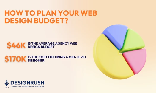
How Much Do Custom Web Designs Cost?
Compared to a templated web design, a custom website will cost more to develop as it takes more time and resources to build it. Be that as it may, a well-made platform will deliver better results and will work best in the long term.
The total cost of a custom web design comes down to a few variables, including:
- Functionalities
- Integrations
- Specific design features
- The number of web pages
- Personalized messaging and web copy
Depending on your website type and size, the cost may vary considerably. Here are some of the most common pricing structures made available by web design companies based in the U.S.:
- Small businesses: Their websites typically require a few pages and simpler design elements, therefore ranging between $25,000 and $30,000.
- Medium-scale businesses: A more complex website involving over 50 web pages, a custom layout, special functionalities, and a content management system (CMS) could cost anywhere between $50,000 to $60,000+.
- Enterprises: For larger websites with hundreds of web pages, unique design elements, CMS, and numerous distinctive functionalities, the cost for a custom web design could begin at $100,000 and go up to hundreds of thousands.
Custom Web Design: Key Takeaways
If you want to craft unique digital experiences that resonate deeply with your brand and audience, custom web design is the way to go.
Now that we’ve covered the key principles of successful design—user-centered experiences, responsive layouts, intuitive navigation, and compelling visuals—you have the tools to elevate your web presence to new heights.
![]()
Our team ranks agencies worldwide to help you find a qualified partner. Visit our Agency Directory for the Top Web Development Companies, as well as:
- Top B2B Web Design Agencies
- AI Web Design Agencies
- Top Front End Web Development Companies
- UI/UX Design Agencies
- Top Web Development Companies in Chicago
Our design experts also recognize the most innovative design projects across the globe. Visit our Awards section to see the best in web design.
Custom Web Design FAQs
1. How can I design my own website?
To design your own website, you should first determine your website's purpose, target audience, and content structure. Select a website builder (e.g., WordPress, Wix) or coding language (e.g., HTML, CSS, JavaScript) to create a visually appealing layout with clear navigation. Use a consistent color scheme, typography, and imagery.
2. What is the difference between custom web design and template-based design?
Custom web design is tailored specifically to your brand, goals, and audience, offering a unique look and feel. It involves a bespoke approach, where designers create a website from scratch. Template-based design, on the other hand, uses pre-designed layouts that can be customized but are generally less flexible. Custom designs are more time-consuming and expensive but offer greater long-term value and uniqueness.
3. Will my custom website be scalable as my business grows?
Yes, one of the key advantages of custom website design is scalability. Custom sites are built with your business’s long-term growth in mind, meaning that as your needs evolve, the website can be adjusted and expanded to accommodate new features, additional content, and increasing traffic without losing performance.