


-account-photo_listing.jpg)
-account-photo_listing.jpg)


Our Jury has worked with Prada, Nike, Chanel, Google, and Apple.
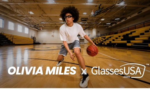
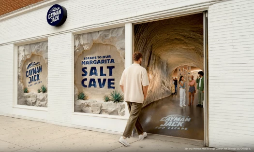
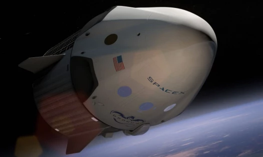
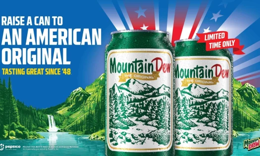
Best Print Designs
Bold, physical, and impossible to ignore. The print designs of 2026 that made people look twice.
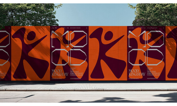
Best Print Designs
4,200+ Submitted Designs
- Advertising
- Architecture
- Arts & Recreation
- Banking & Finance
- E-Commerce & Retail
- Education
- Engineering
- Entertainment
- Environmental Ads and Brand Designs
- Fashion & Beauty
- Food & Beverage
- Government
- Health & Wellness
- Hospitality
- Legal & Insurance
- Luxury
- Manufacturing
- Medical & Pharmacy
- Non-Profit
- Professional Services
- Real Estate
- Sports & Leisure
- Technology
- Travel
View Design
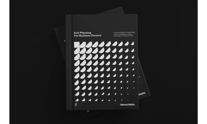
Haines Watts
View Design
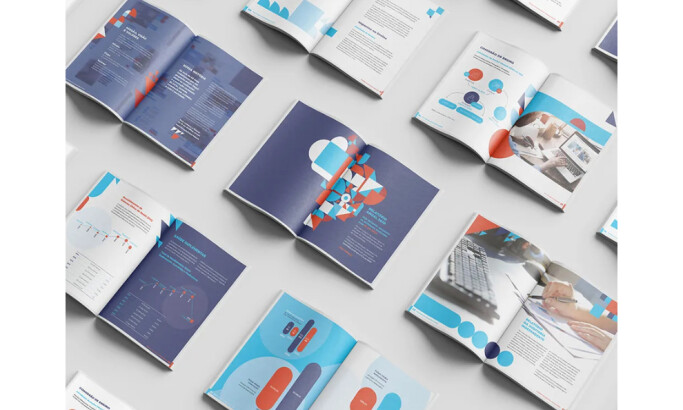
Annual Report 2020 FZ
View Design
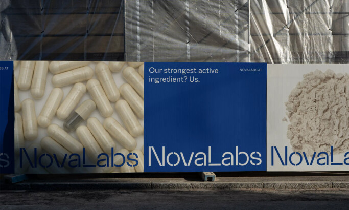
NovaLabs
View Design
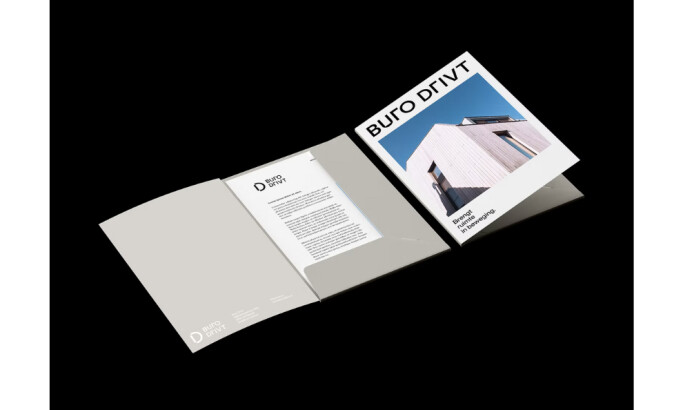
Buro Drivt
View Design
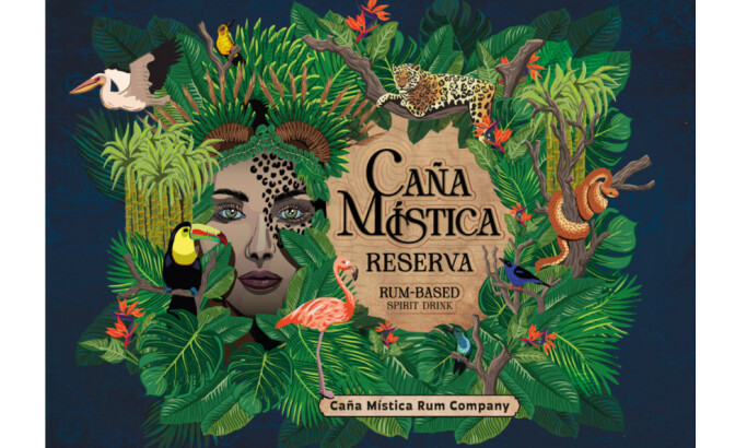
Caña Mística Rum Label
View Design
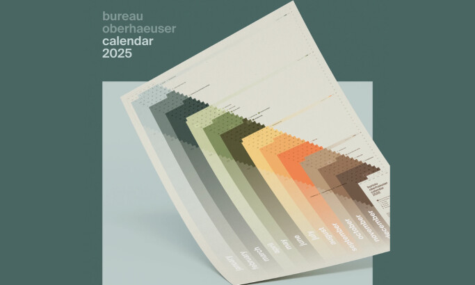
Bureau Oberhaeuser Calendar 2025
View Design
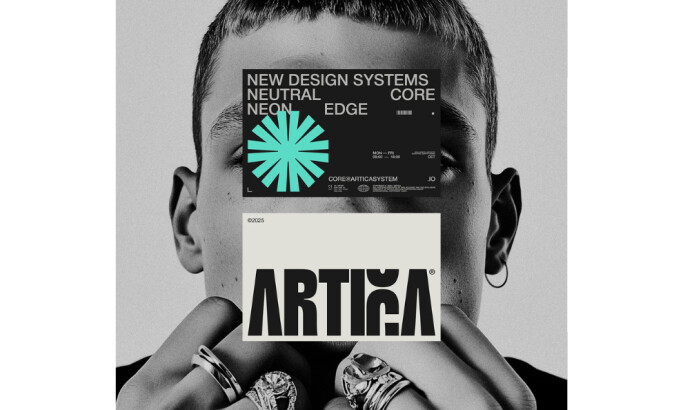
ARTICA®
View Design
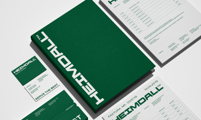
Heimdall
Get Connected
With The Right Agency Partner
& Receive Proposals For FREE
View Design
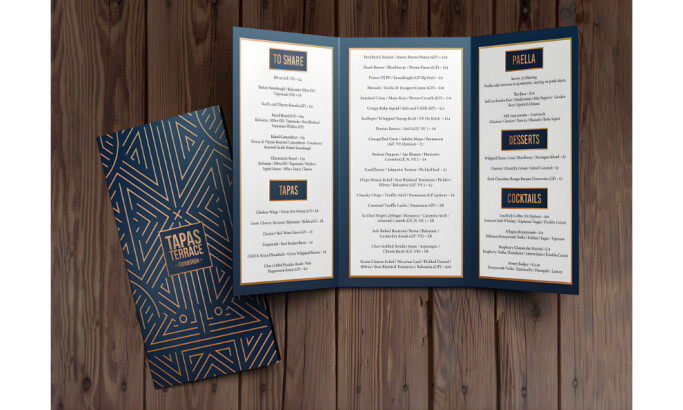
Tapas Terrace
View Design
BIMAL - Promotional Material
View Design
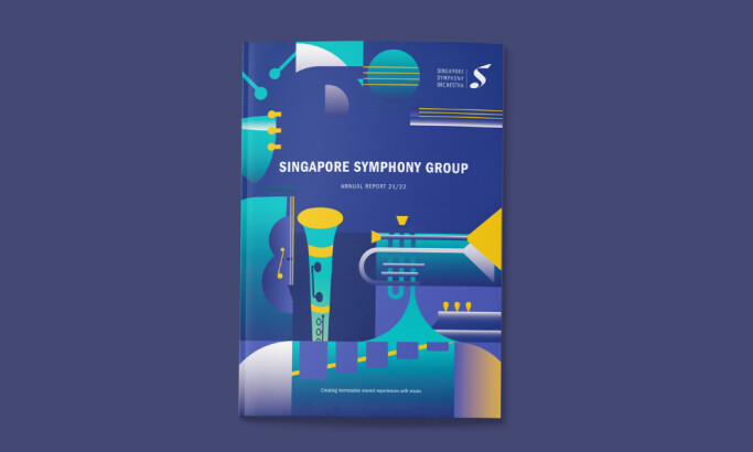
Singapore Symphony Group
View Design
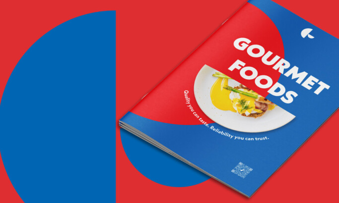
Gourmet Foods
View Design
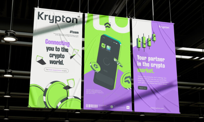
Krypton
View Design
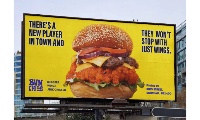
Bunchies
View Design
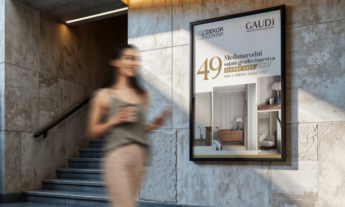
Dekor Centar
View Design
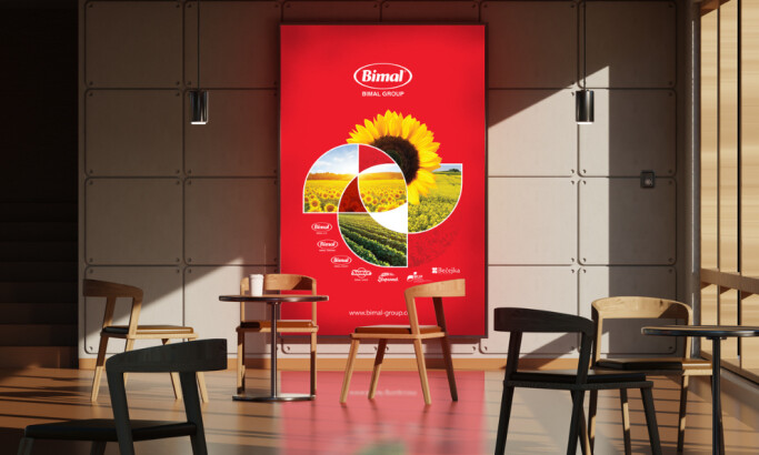
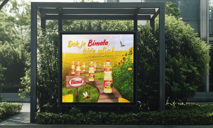
BIMAL – Outdoor Campaign
View Design
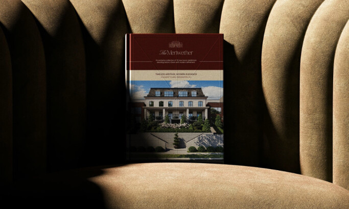
The Meriwether
byHeraphy
Ready to elevate your designs?