-account-photo_listing.jpg)
-account-photo_listing.jpg)


Our Jury has worked with Prada, Nike, Chanel, Google, and Apple.
Best Print Designs
Bold, physical, and impossible to ignore. The print designs of 2026 that made people look twice.
Best Print Designs
4,200+ Submitted Designs
- Advertising
- Architecture
- Arts & Recreation
- Banking & Finance
- E-Commerce & Retail
- Education
- Engineering
- Entertainment
- Environmental Ads and Brand Designs
- Fashion & Beauty
- Food & Beverage
- Government
- Health & Wellness
- Hospitality
- Legal & Insurance
- Luxury
- Manufacturing
- Medical & Pharmacy
- Non-Profit
- Professional Services
- Real Estate
- Sports & Leisure
- Technology
- Travel
View Design
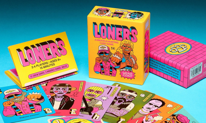
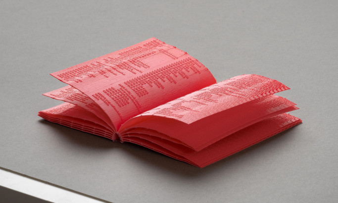
Loners Print Design
View Design
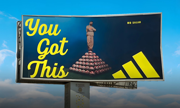
Adidas Egypt - You Got This Print Design
byCheil
View Design
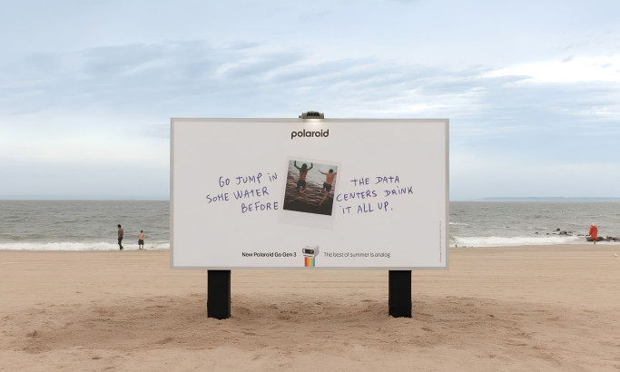
Polaroid - The Best of Summer Is Analog Print Design
View Design
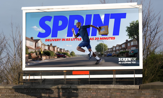
Screwfix: No Stopping You Print Design
View Design
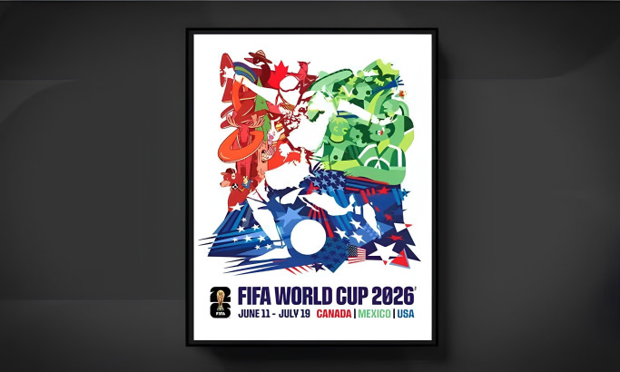
FIFA World Cup 2026 Official Tournament Poster Print Design
View Design
Manual Print Design
View Design
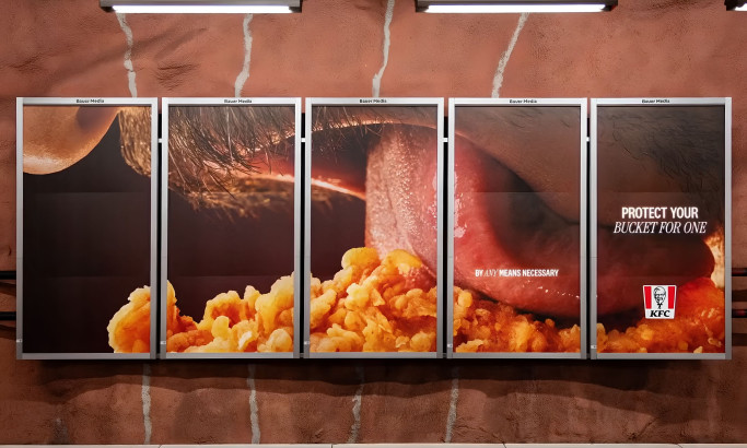
KFC - Bucket For One Print Design
View Design
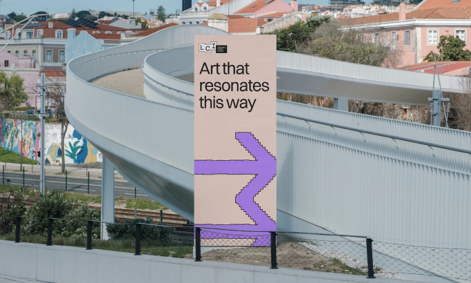
Lithuanian Culture Institute Print Design
View Design
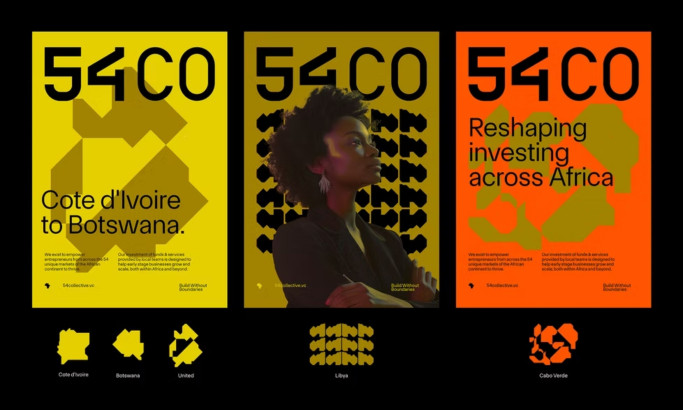
54 Collective Print Design
byBCKRDS
Get Connected
With The Right Agency Partner
& Receive Proposals For FREE
★9.36/10
 AO 10.00
 BS 7.20
 BS 10.00
 KS 9.60
 LB 10.00
View Design
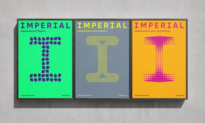
Imperial College London
View Design
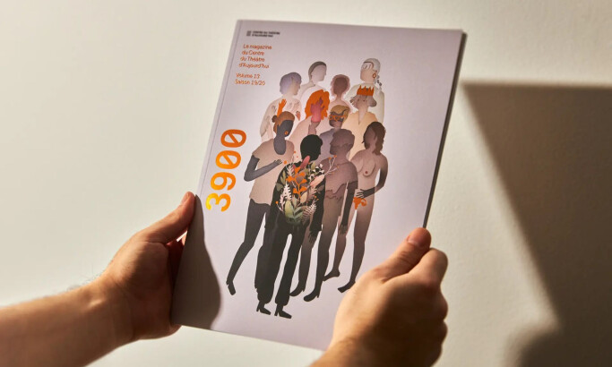
3900 — Volume 13 Magazine
View Design
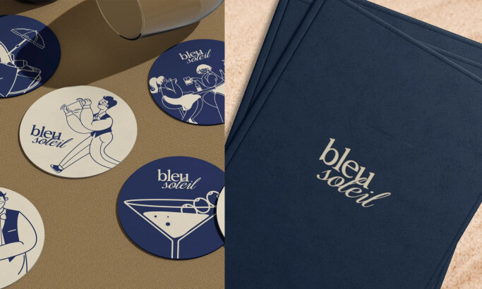
Bleu Soleil
★7.76/10
- AO 10.00
- BS 8.00
- BS 8.80
- KS 5.60
- LB 6.40
View Design
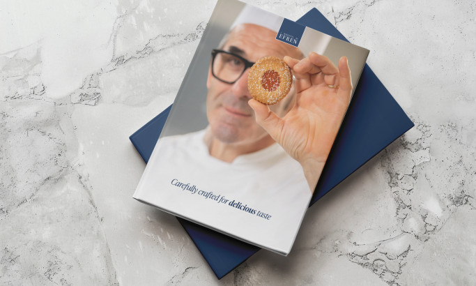
I Biscotti di Efren
View Design
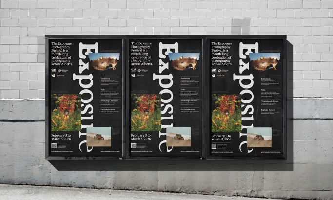
Exposure Photography Festival
★8.4/10
- AO 8.80
- BS 8.40
- BS 9.60
- KS 9.20
- LB 6.00
View Design
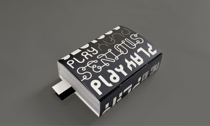
Serious Play

View Design
Outset Law
byWegrow
View Design
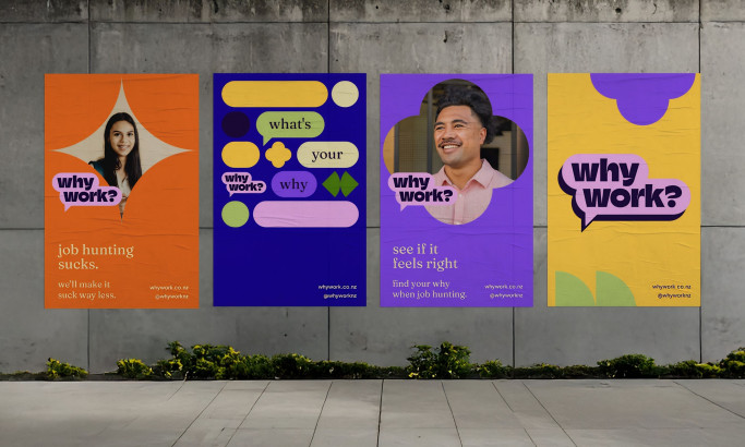
WorkWhy?
byIdyllic

View Design
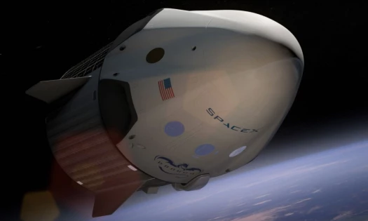
FIFA World Cup 2026
Ready to elevate your designs?